
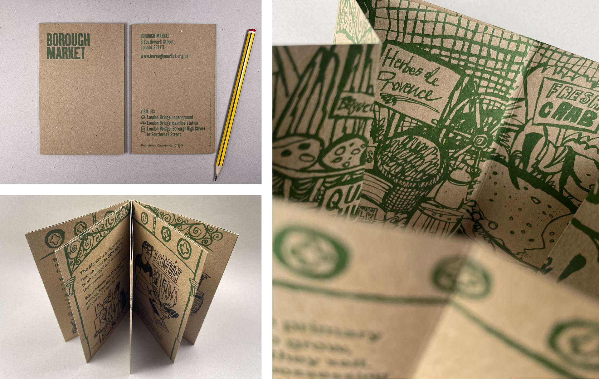
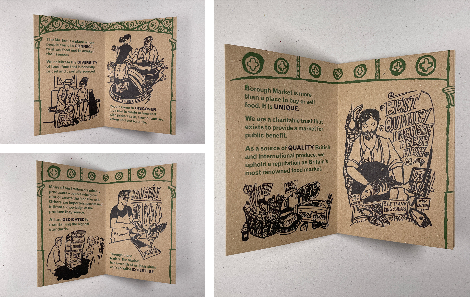
During the building of Network Rail's viaduct over Borough Market, numerous changes were made to the architecture and operation of the Market. As part of the Market's subsequent relaunch I was asked to design a booklet to communicate the 'vision and values' of Borough Market. I gradually built on this design to develop a new visual style that remained in place for the next few years.
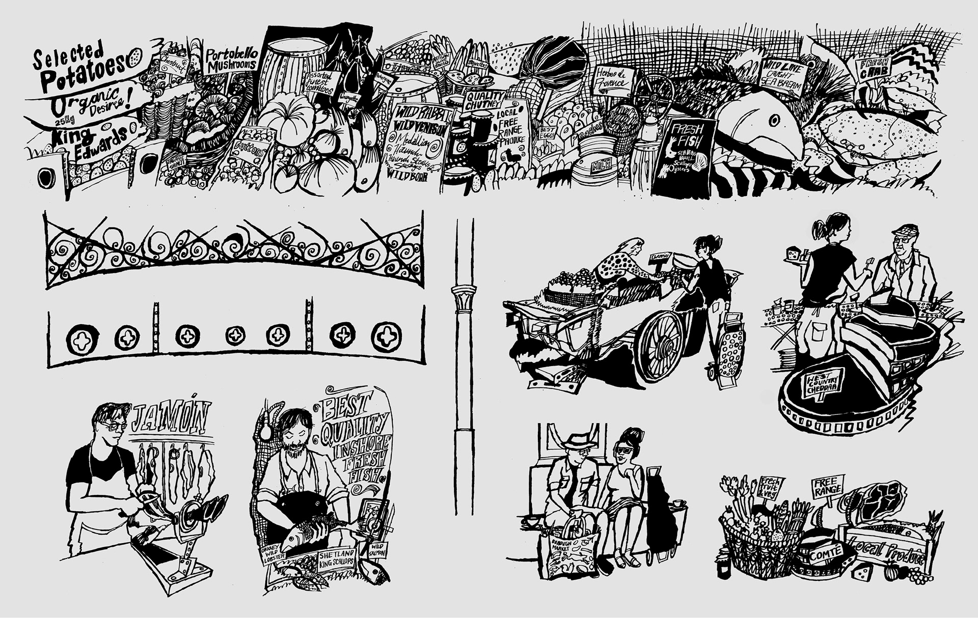
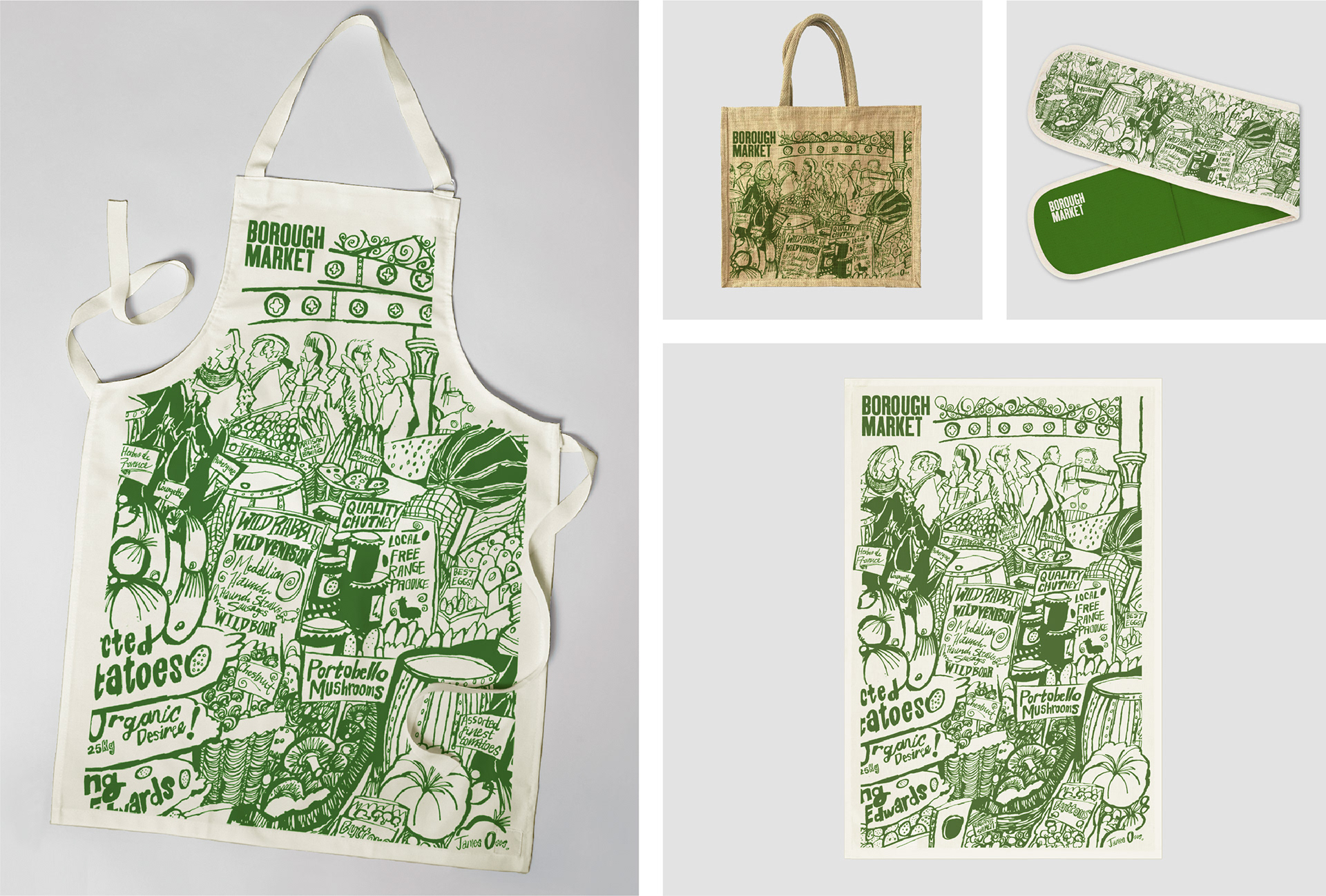
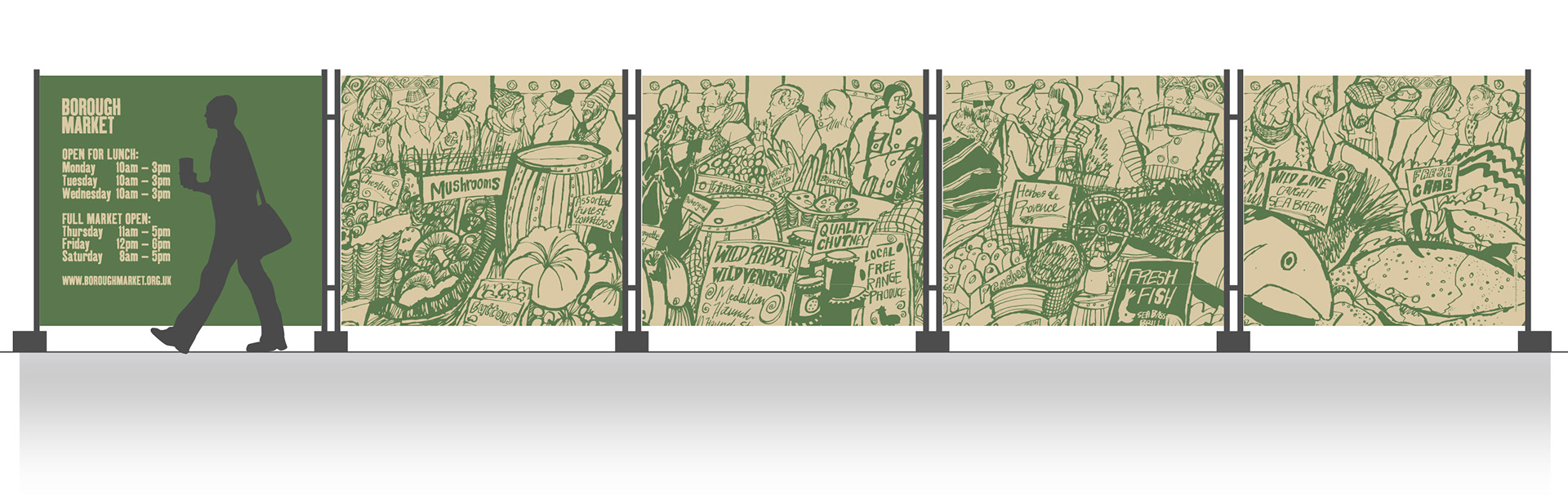
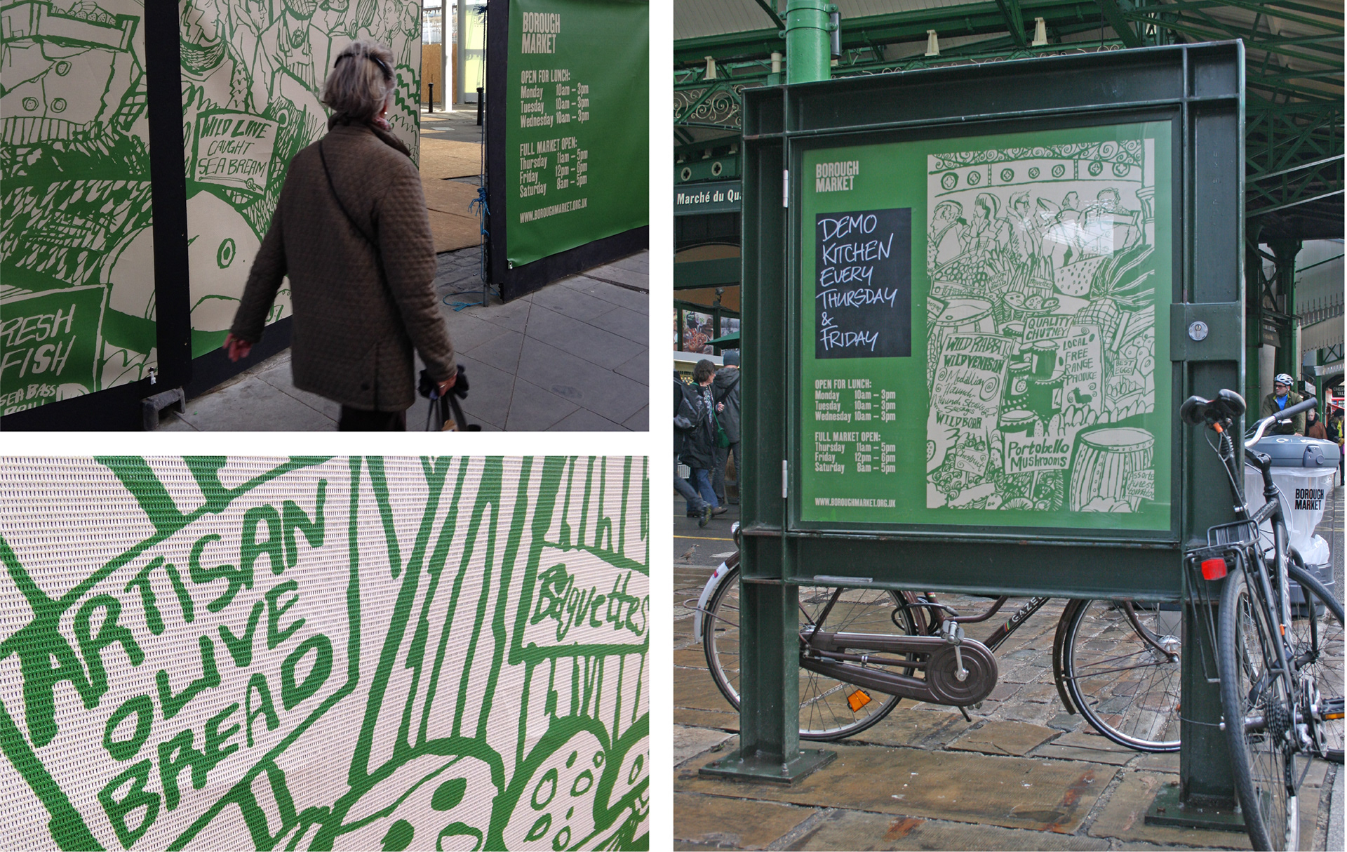
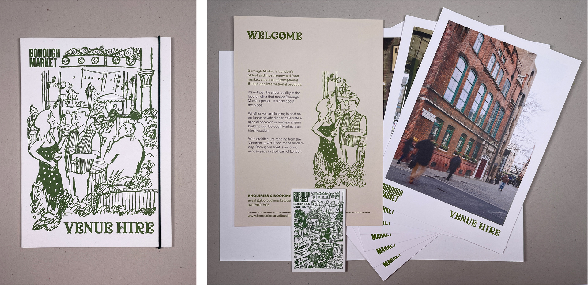
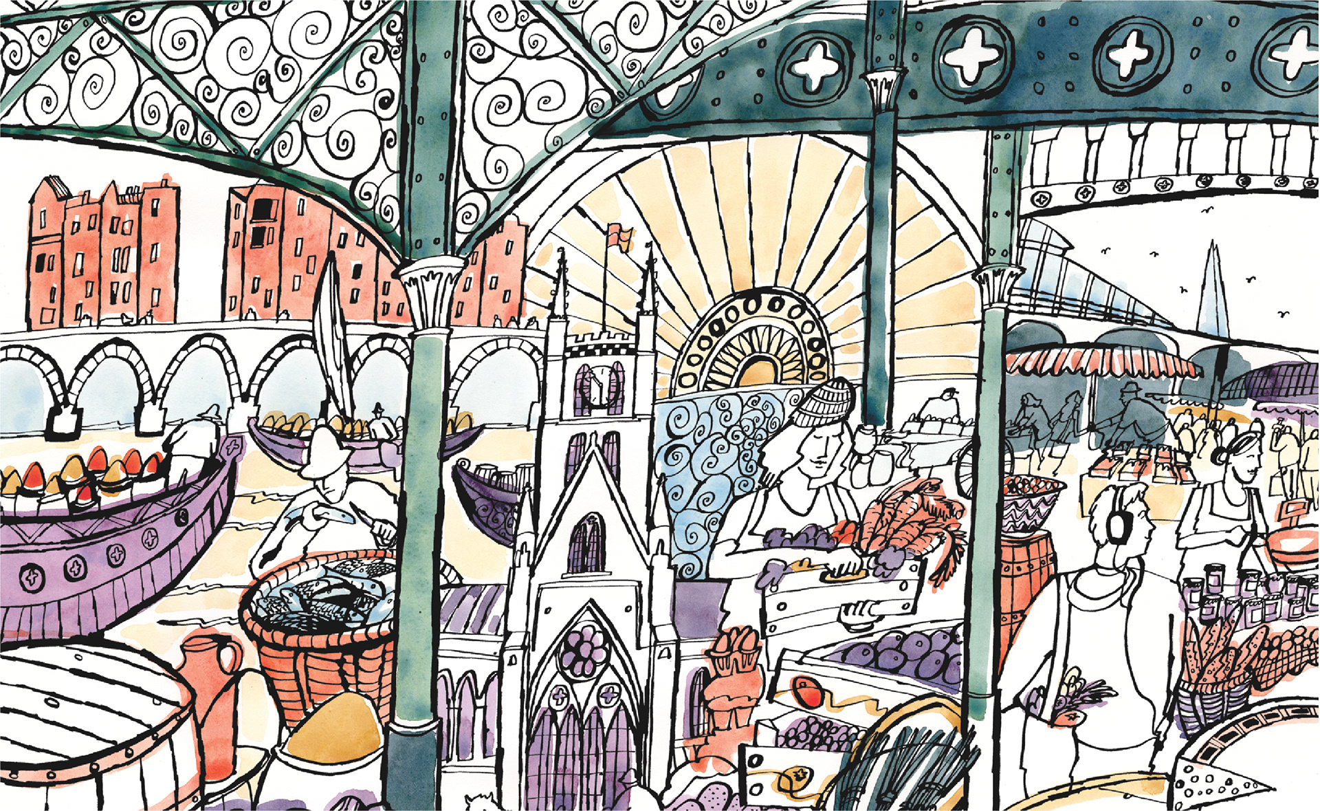
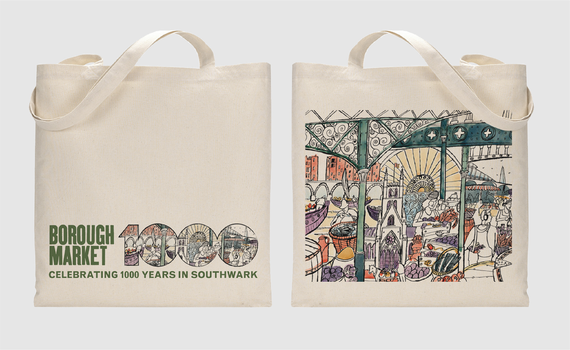
I briefed illustrator James Oses to help work on the initial booklet. James illustrated a 'frieze' of market produce, a number of trader and customer portraits, plus sections of the Market's decorative ironwork roof which I felt was an important recognisable Market motif to include. James's lively, detailed ink drawings helped convey a sense of the diversity of produce and the character of the Market.
FFKipp, a woodtype style typeface, and Monotype Grotesque, a family of functional sans-serif trade fonts designed in the 1930s, were retained from the previous identity. The inconsistencies of the Monotype Grotesque font family exist because each new style was added over time, as different fonts were required, rather than designed together.
This haphazard typeface development draws a neat parallel with the way the Market has grown over the years, the resulting typestyles echoing the array of signage styles seen around the Market today.
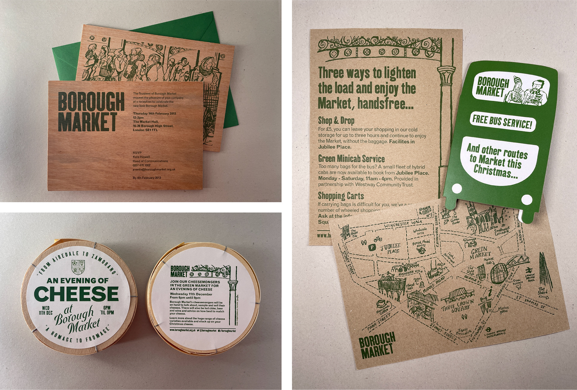
The 10-page folded booklet was made from a single piece of recycled kraft board and printed using two colours.
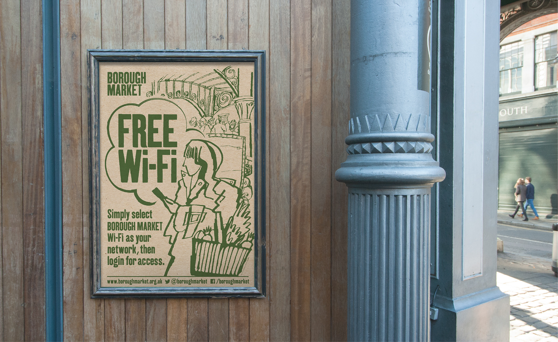
This visual style was developed further for new design applications. To help do this, I asked James to draw additional portraits which, along with the booklet illustrations, would create a versatile 'kit' that I could work with to compose new illustrative design elements.
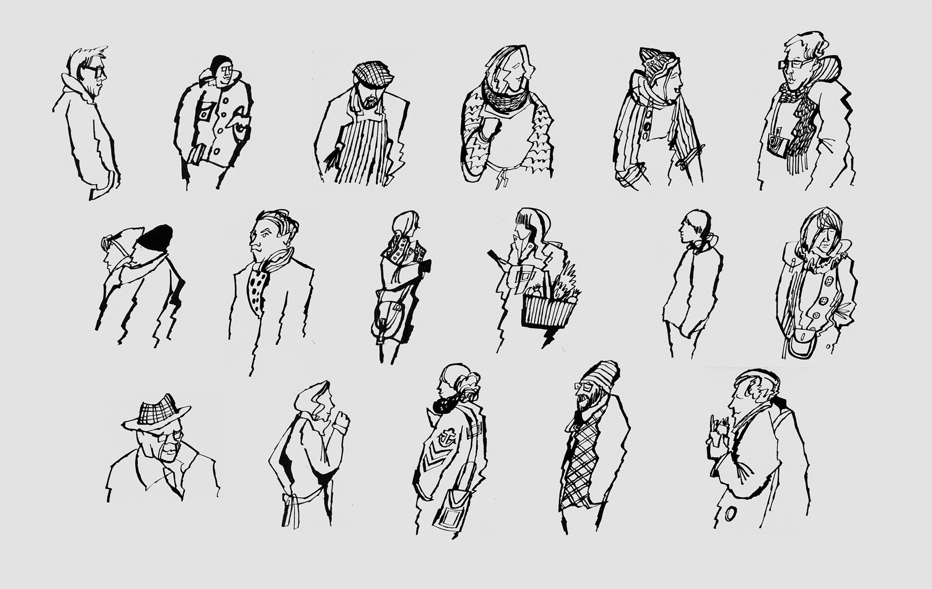
Knowing the speed at which design work was often required by the Market, I felt this kit approach could be an effective way to keep the visual style consistent, despite the lack of time often available for creating new designs.
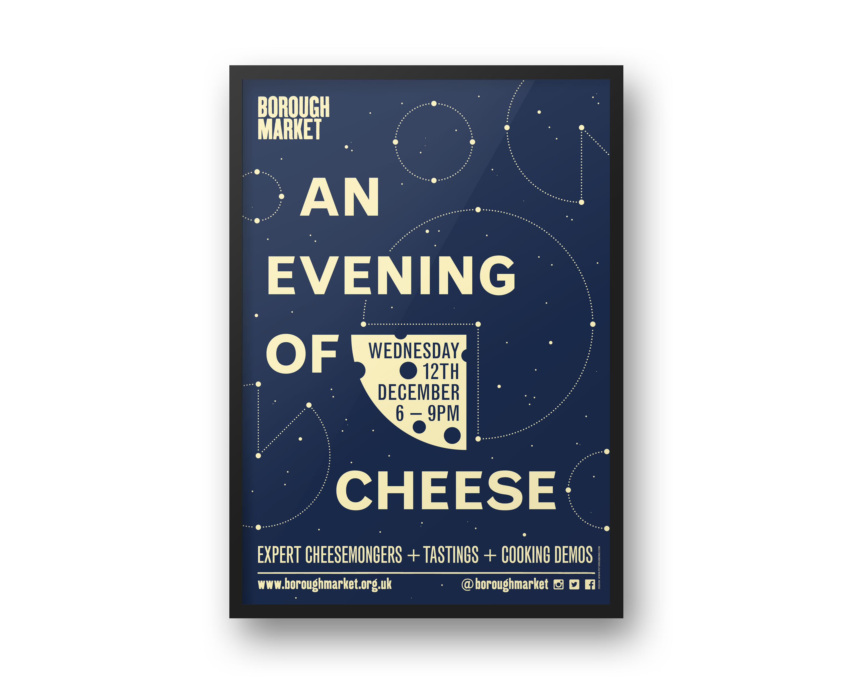
The susbsequent design applications were many and diverse: from flyers, maps and merchandise to A1 posters and large format hoardings.
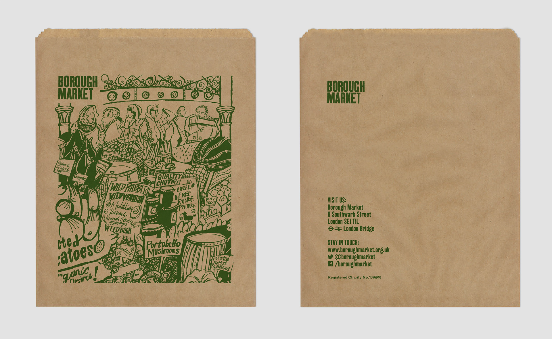
The use of natural, tactile materials, like recycled papers, kraft board and plywood, brought some of the character of the Market into the printed promotional material.
A flexible approach to the use of supporting typefaces allowed for different promotions to have their own personality but within a recognisable visual identity.
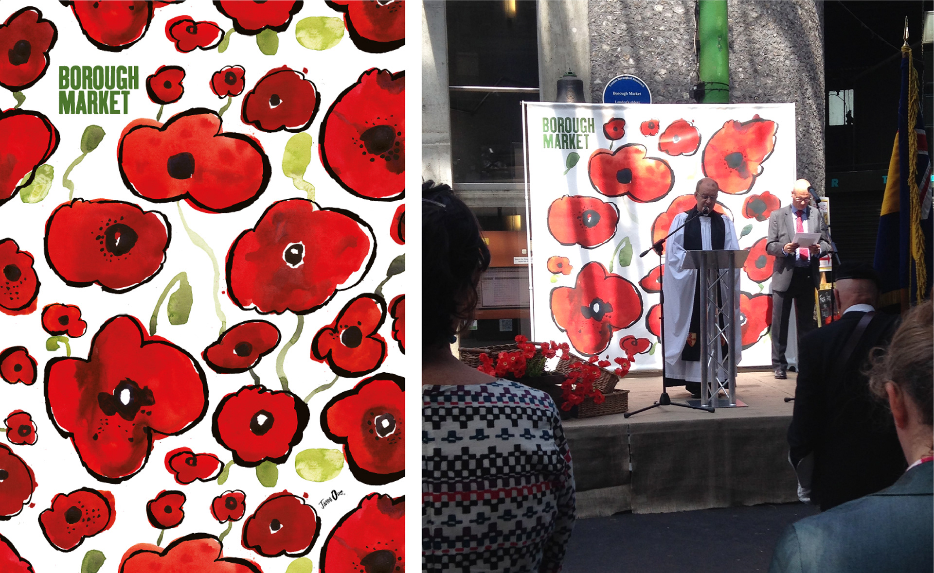
As the marketing activity grew, James created new illustrations that I could combine with the original set as part of new design projects...
... and he created some brilliant bespoke illustrations for Market celebrations like these:
To see more of James's work visit www.jamesoses.co.uk
“Pete's work has played a critical role in the establishment and evolution of Borough Market's brand identity over the last few years. He has the ability to understand the needs of clients and produce superb creative solutions, bringing with him excellent project management skills that always deliver.”
KATE HOWELL, DIRECTOR OF DEVELOPMENT & COMMUNICATIONS