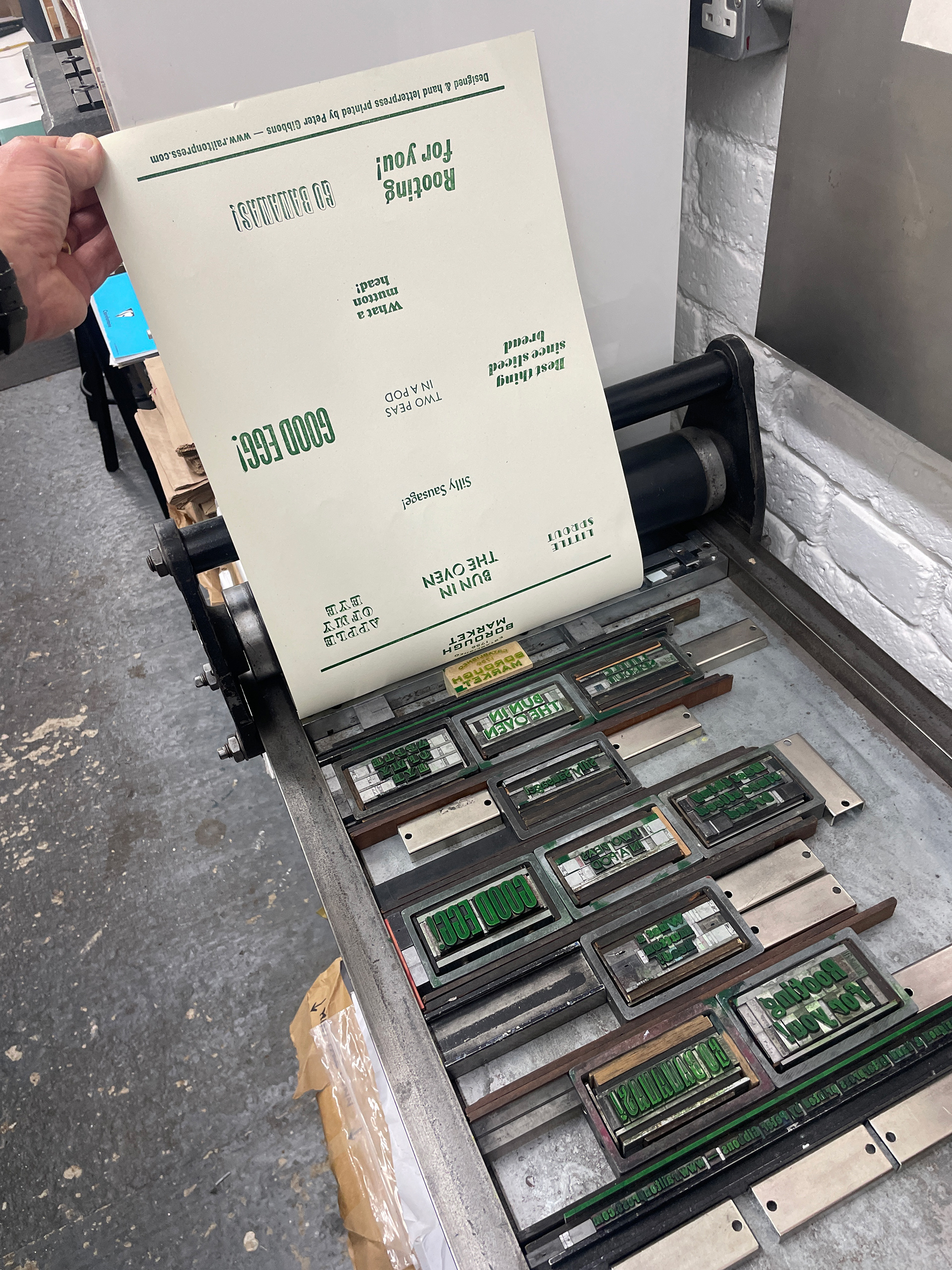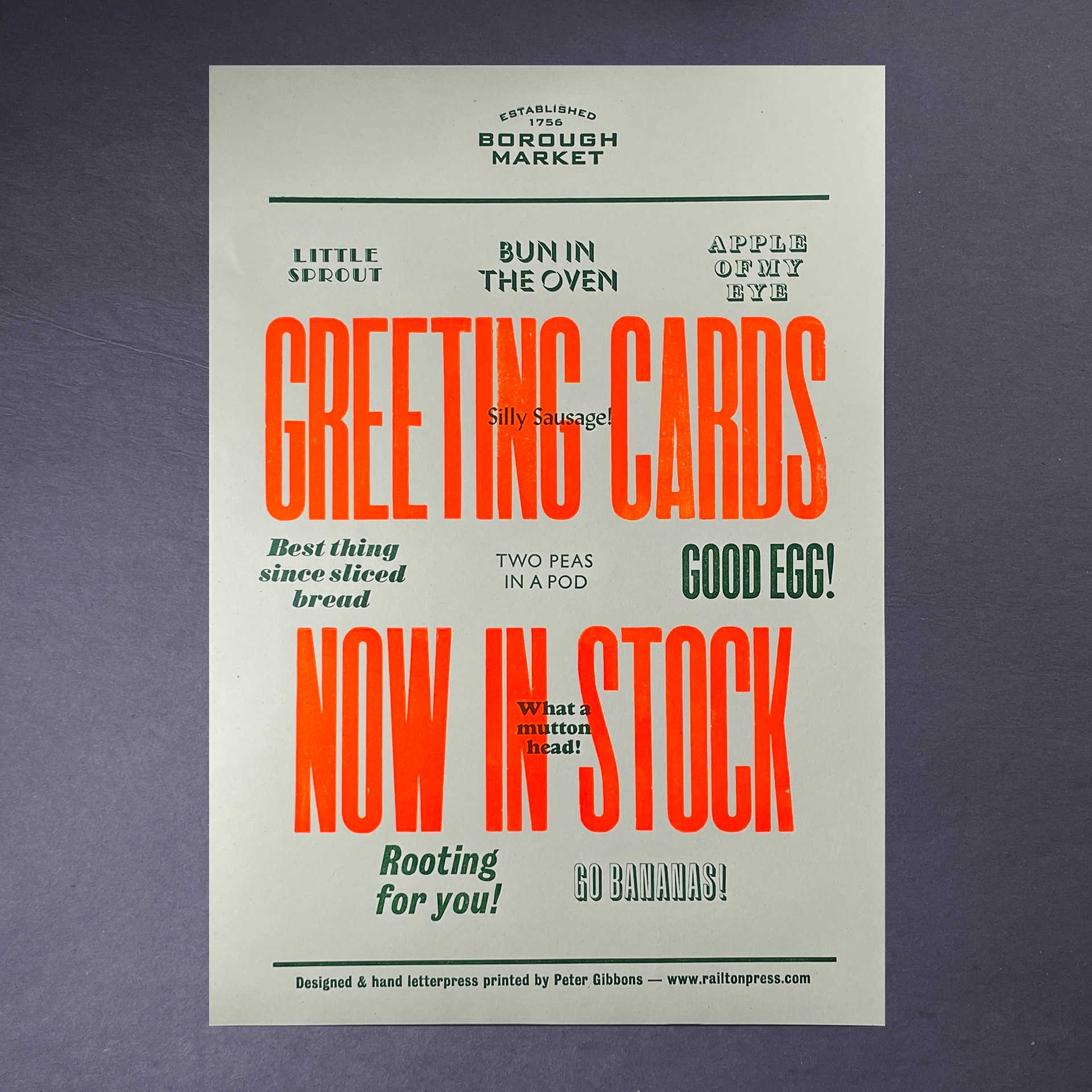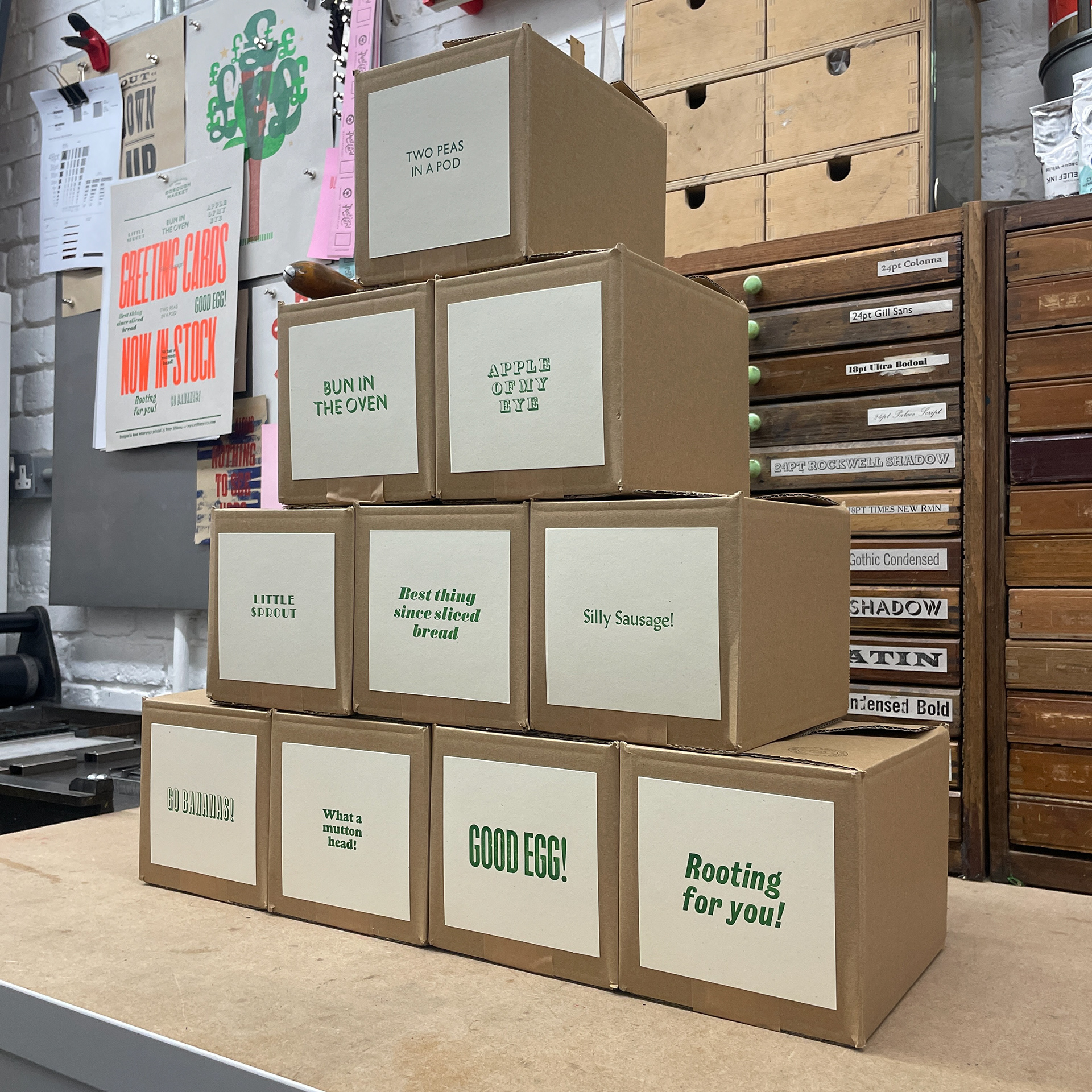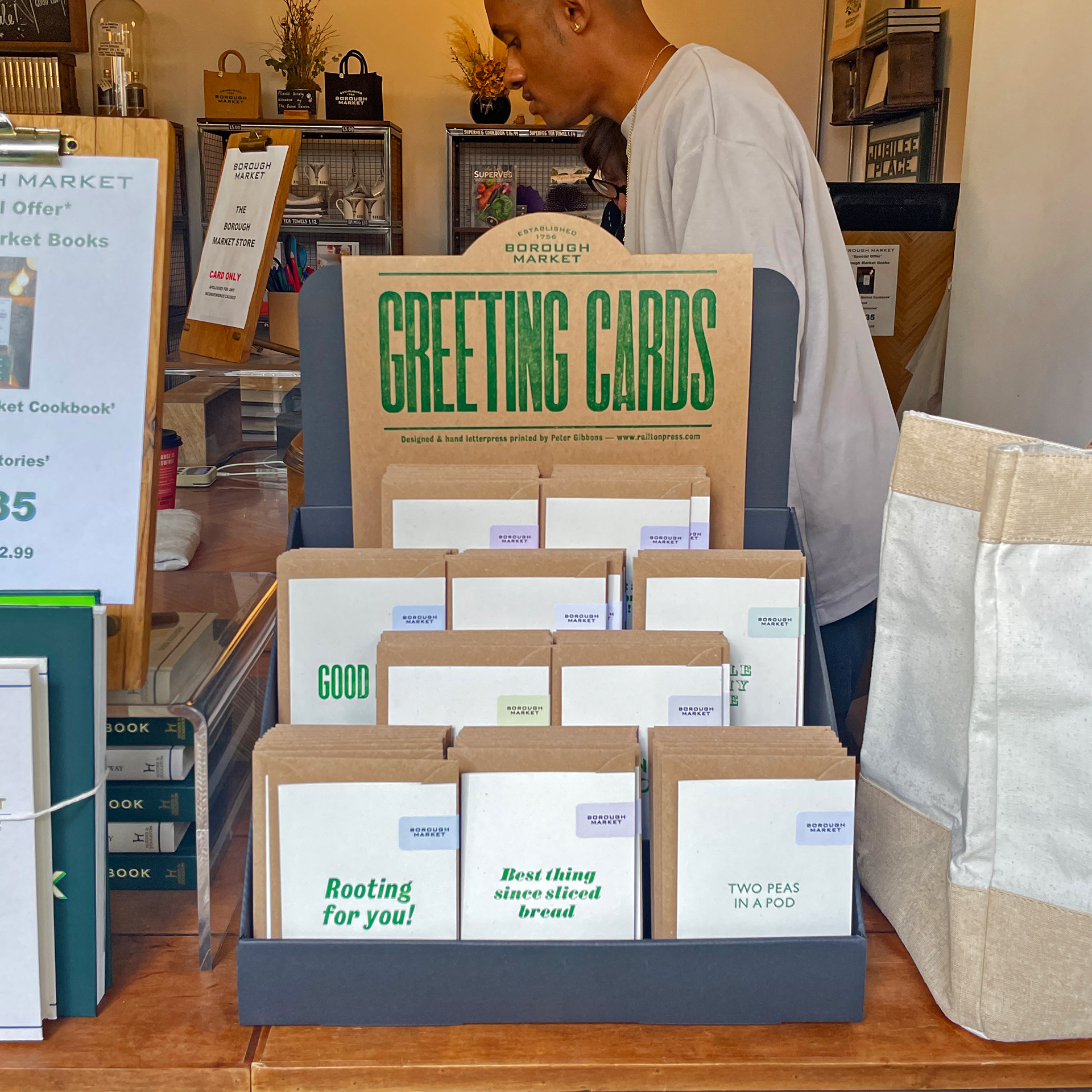

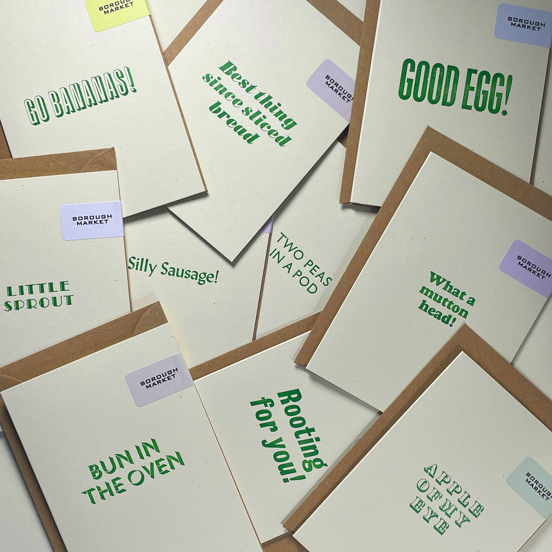
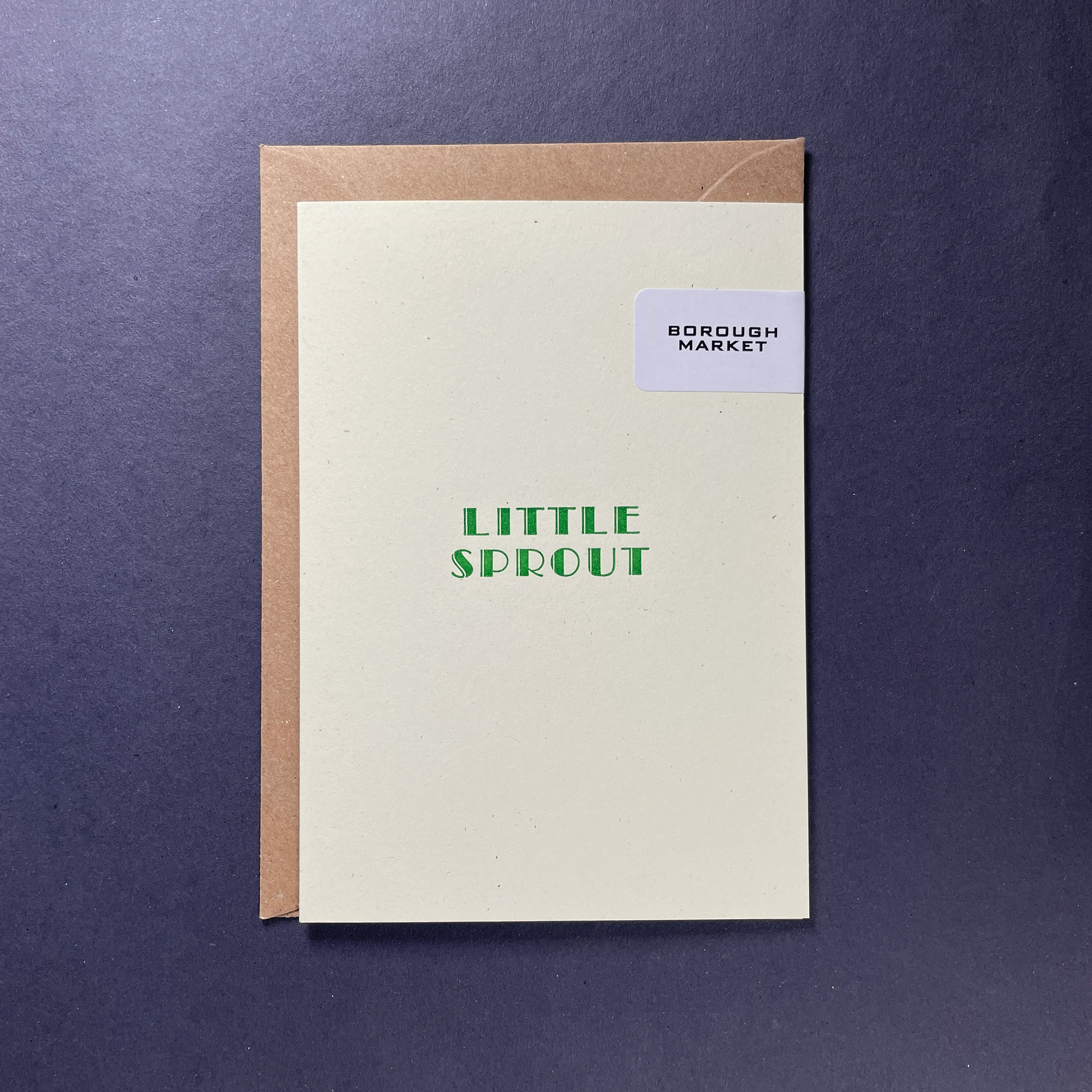
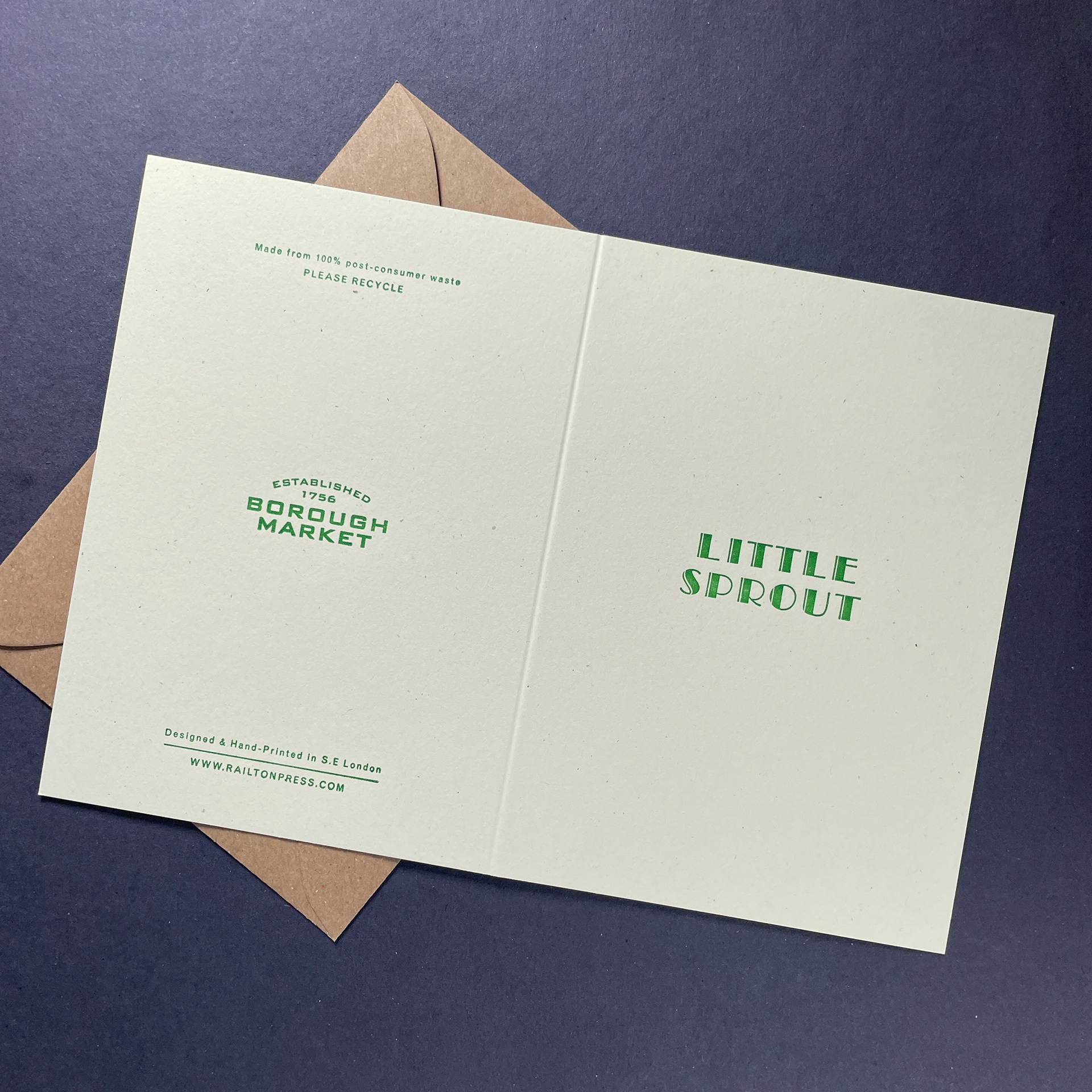
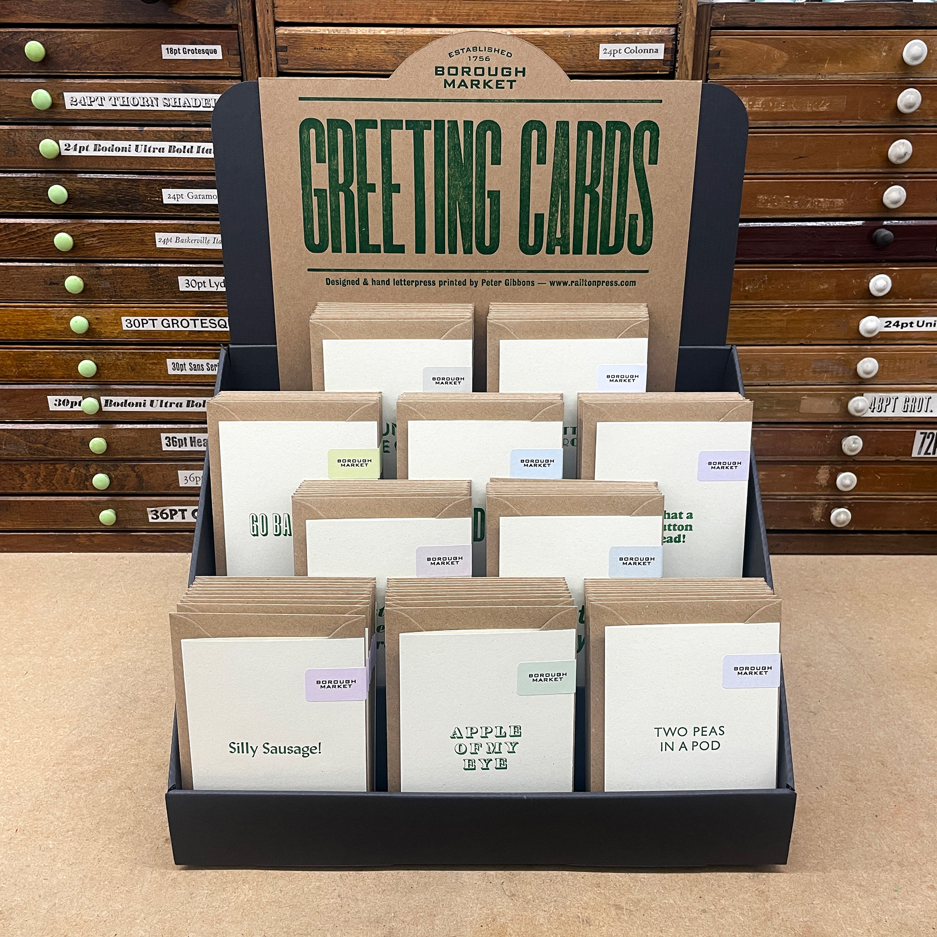
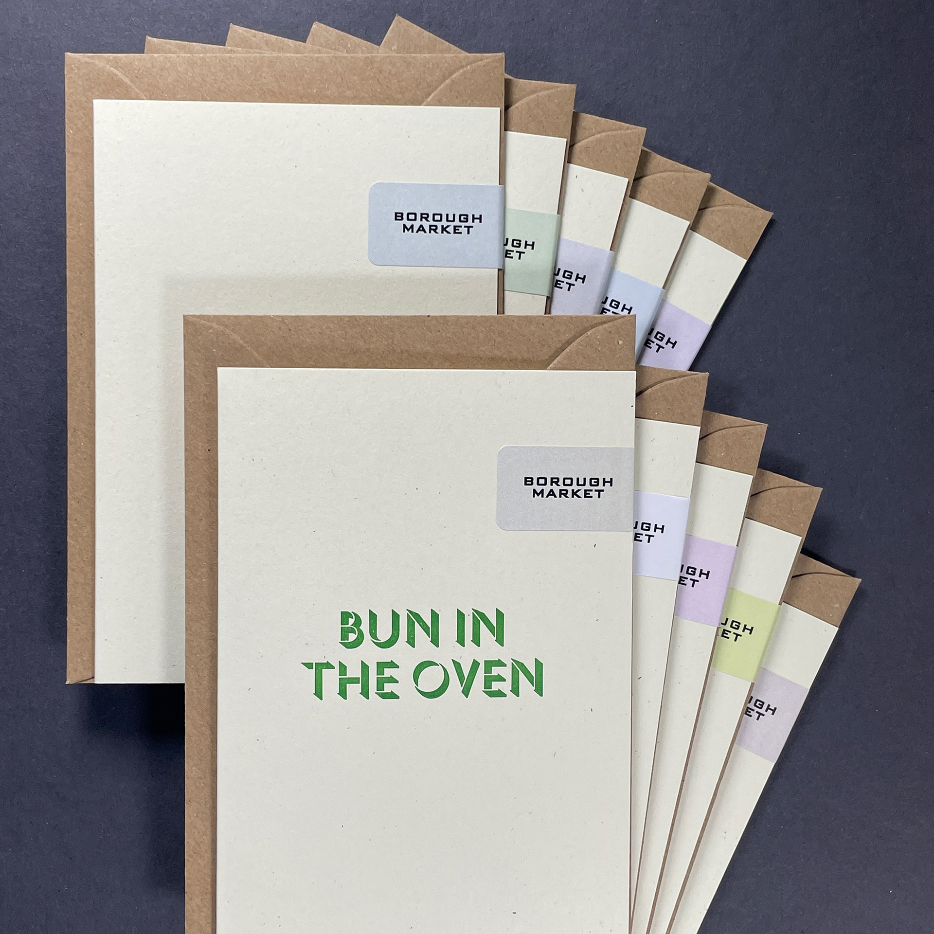
The range of ten typographic designs features Market produce-related idioms that lend themselves to card-giving. Each phrase was printed using a different typeface, a nod to the assortment of trader's signage displayed around the Market. Green ink, a pale cream card with inclusions, and kraft envelopes were chosen to reflect the Market's visual identity, with pastel labels to add colour and aid differentiation.
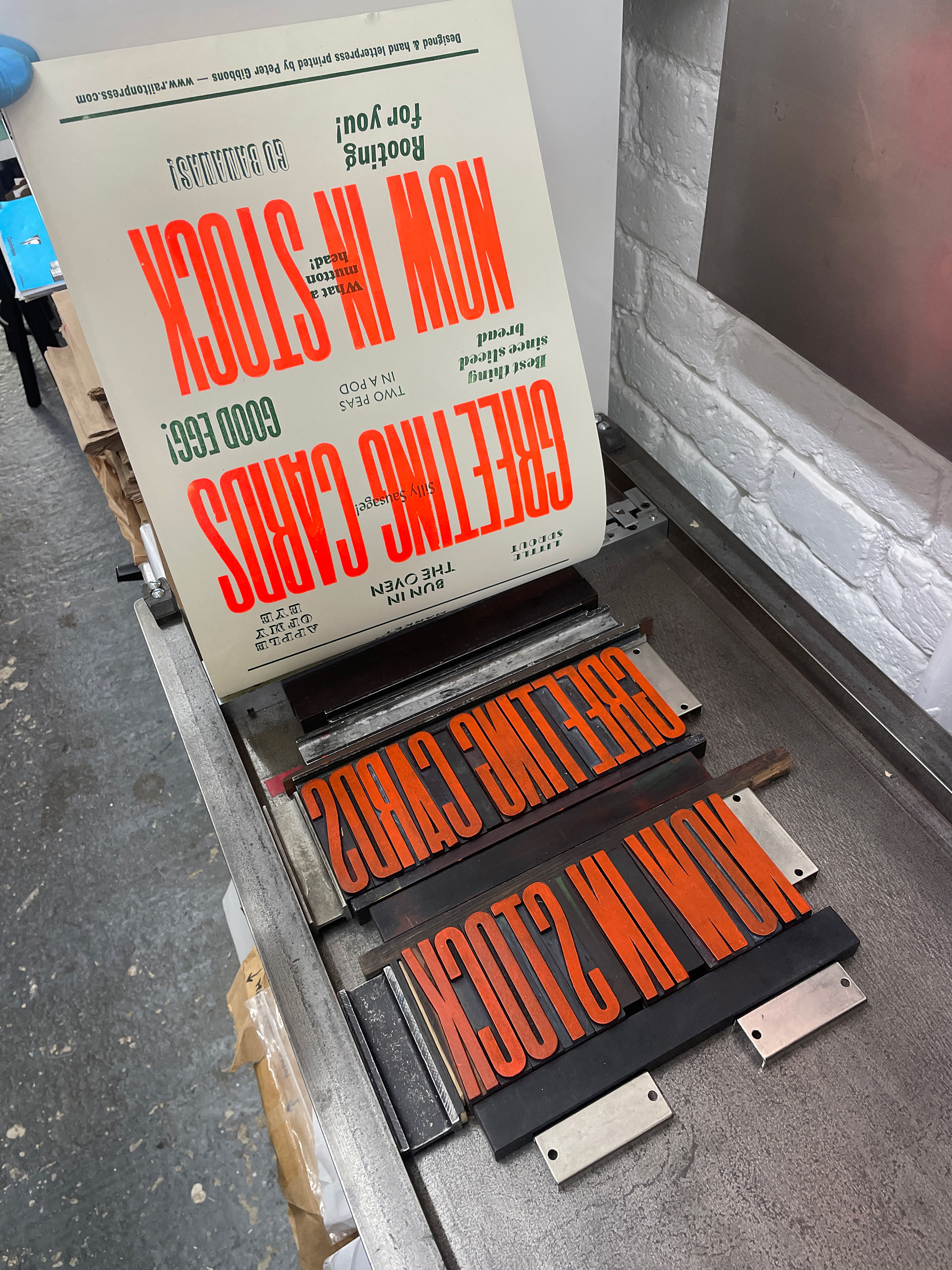
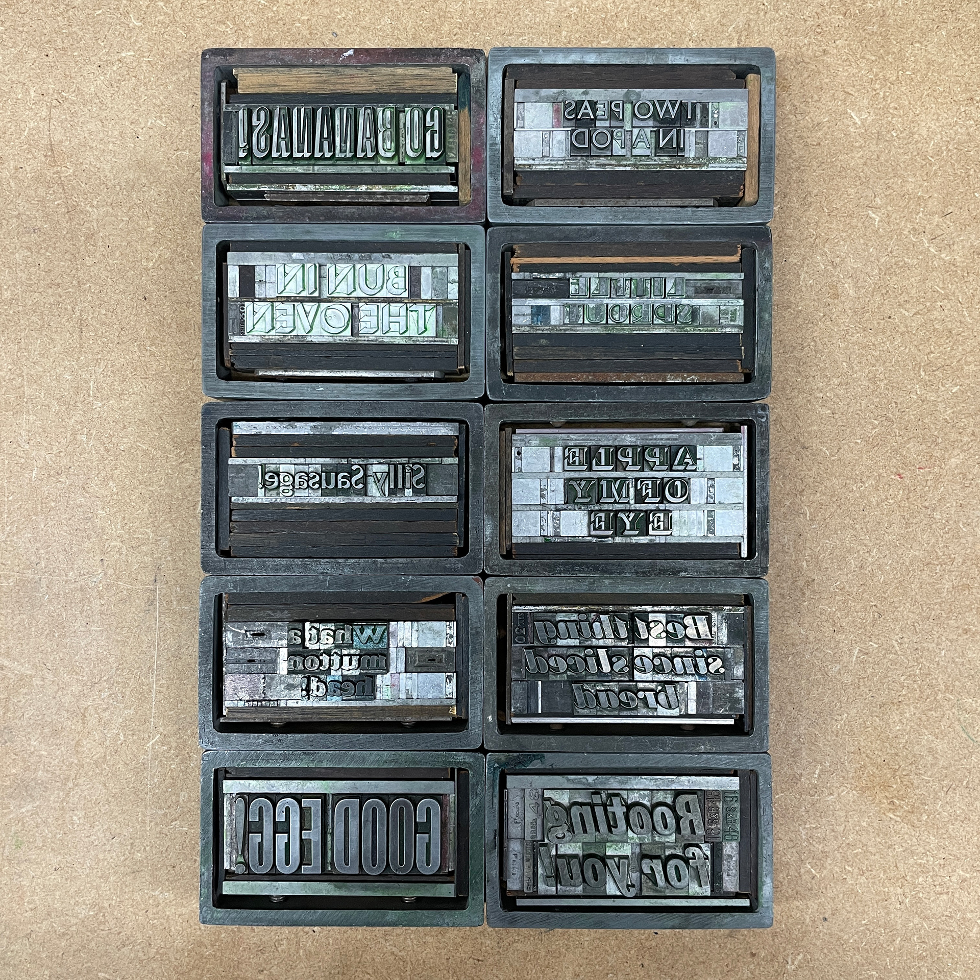
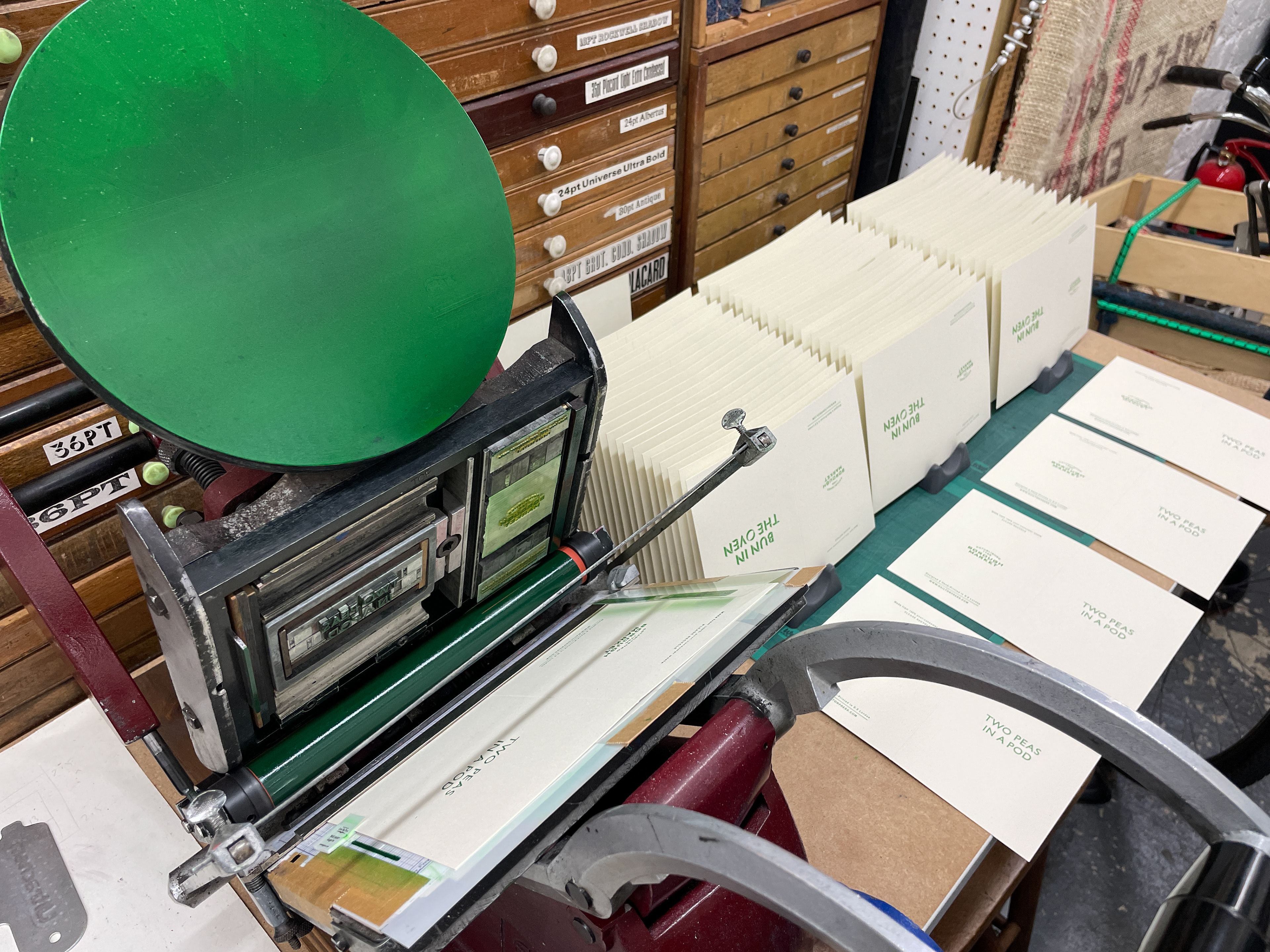
The designs were hand-set using antique metal type and printed in-house using a hand-operated letterpress machine.
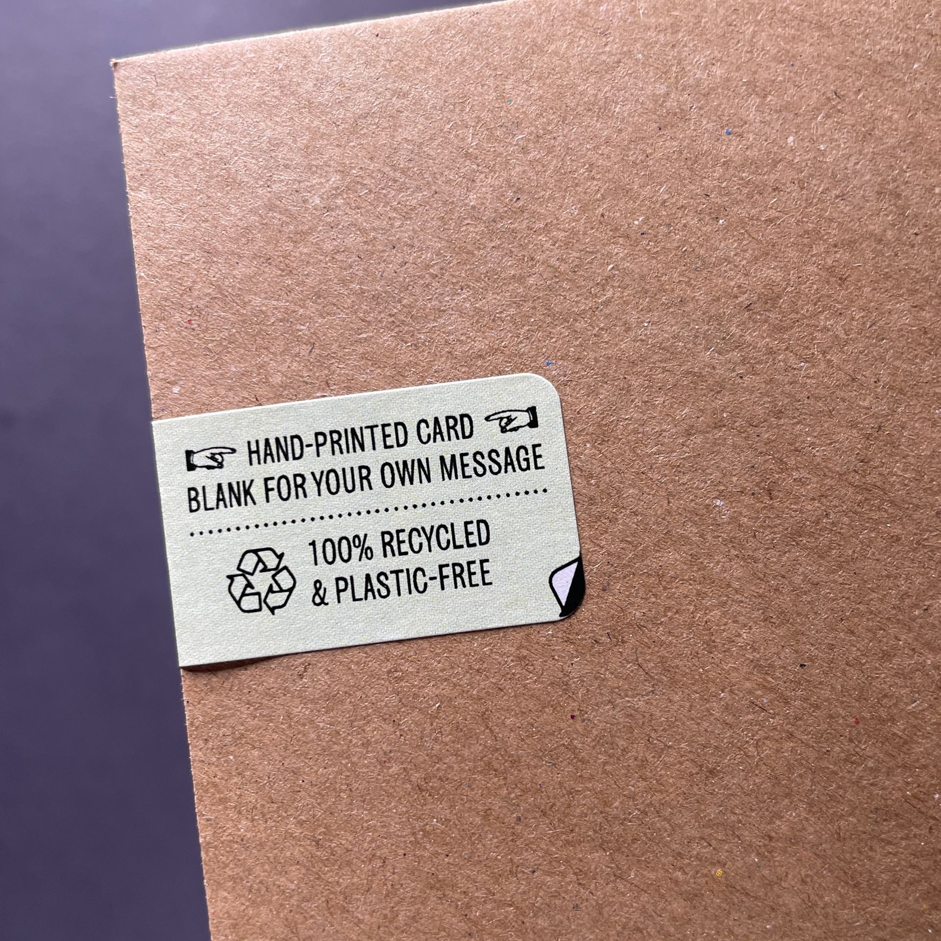
In line with the Market's sustainability policy, the cards are made from 100% recycled, uncoated stock with recycled kraft envelopes and have removable labels instead of plastic packaging.
Point of sale posters and a customised display stand were also designed and lettepress printed by hand. The cards are now on sale in the Borough Market store.