
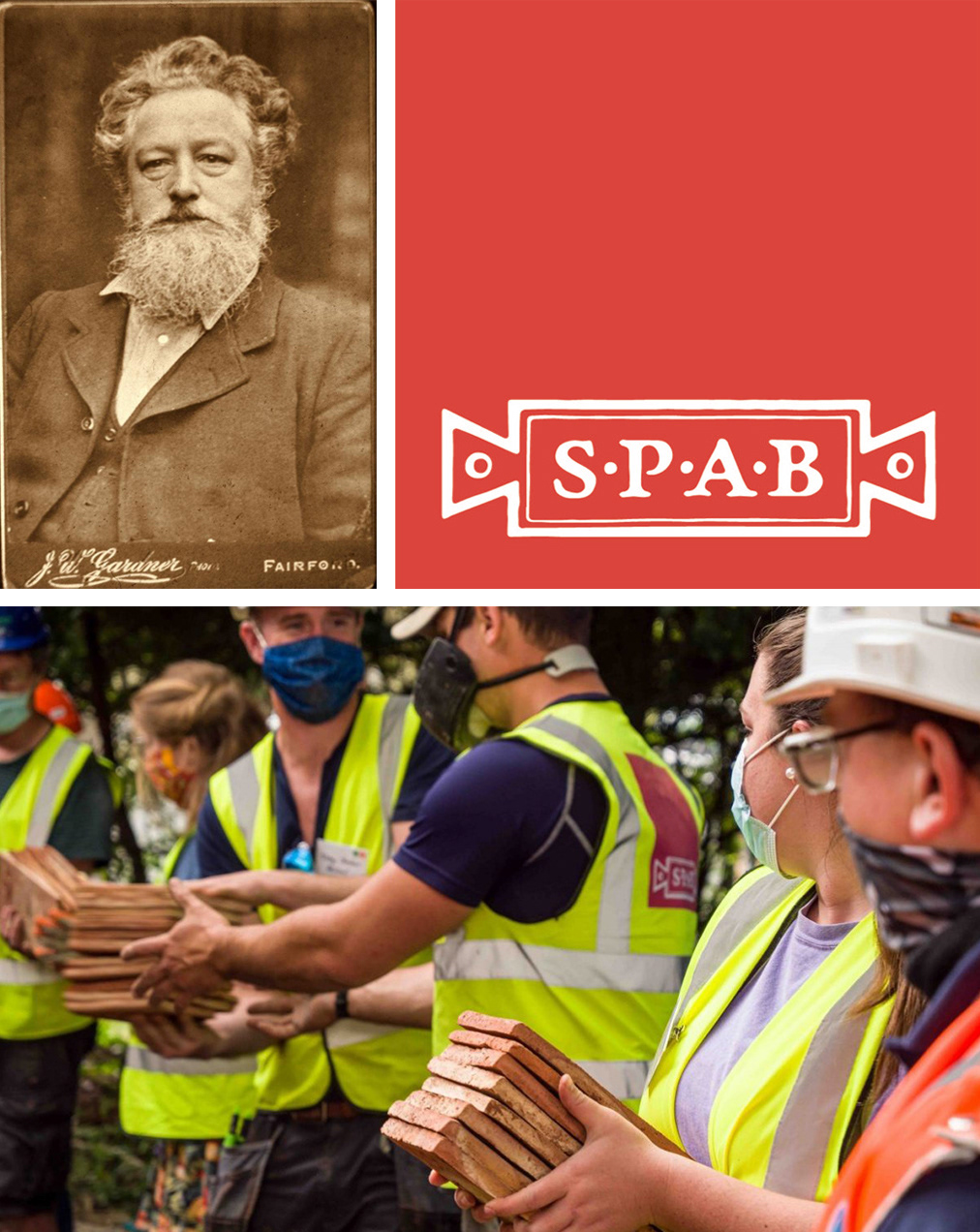
The Society for the Protection of Ancient Buildings (SPAB) is the UK’s oldest building conservation body, founded by William Morris and Phillip Webb in 1877. It protects historic buildings through conservation advice, training and campaigning.
The Society’s approach is considered by many as the yardstick for building conservation principles and techniques and is based on the protection of the 'fabric' of a building: the material from which a building is constructed. It advocates for innovative new design to complement the historic environment and ensure a long a sustainable future.
The SPAB’s existing awards celebrated the craftspeople, custodians and practitioners that maintain the UK's built heritage. The Society wanted to combine these long-respected awards together with fresh categories to reflect the new challenges facing the historic environment and those to take care of it. All categories were to be combined under one dedicated event, The SPAB Heritage Awards.
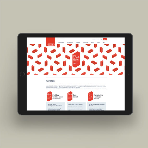
My brief was to create a stand-alone visual identity for the awards that could sit alongside the SPAB brand in a fresh, distinctive way. The scope included the design of the trophy, primary logo, awards logos, web and social media graphics.
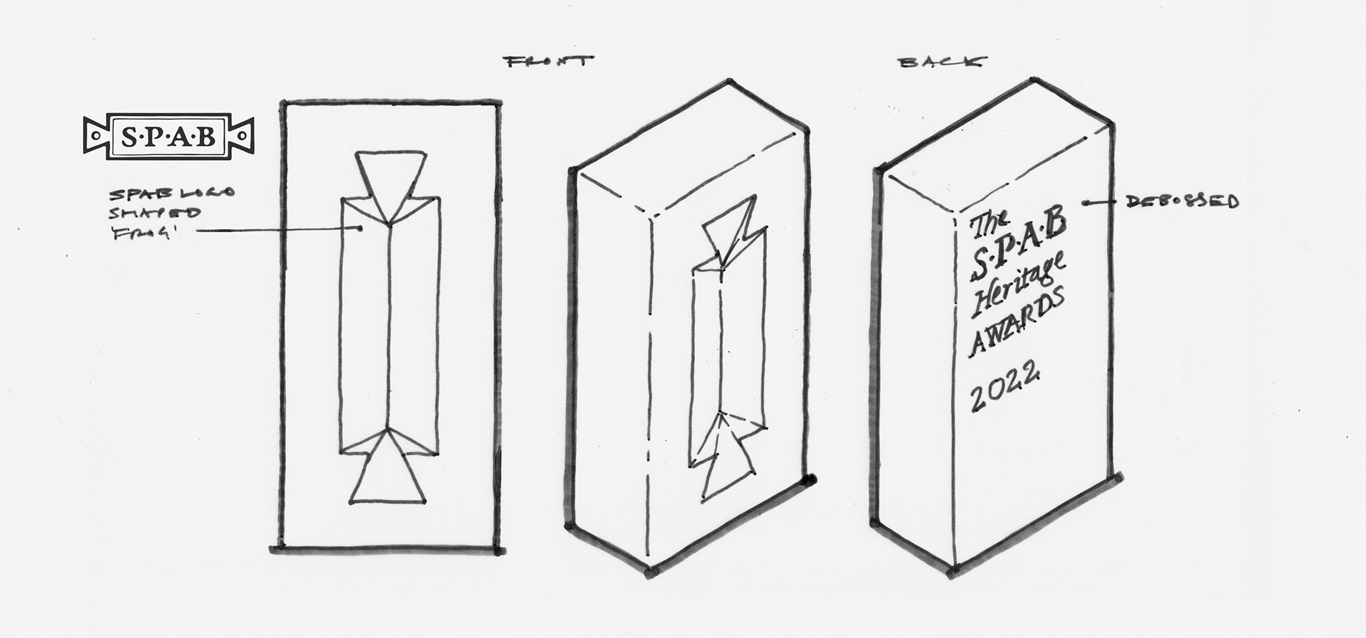
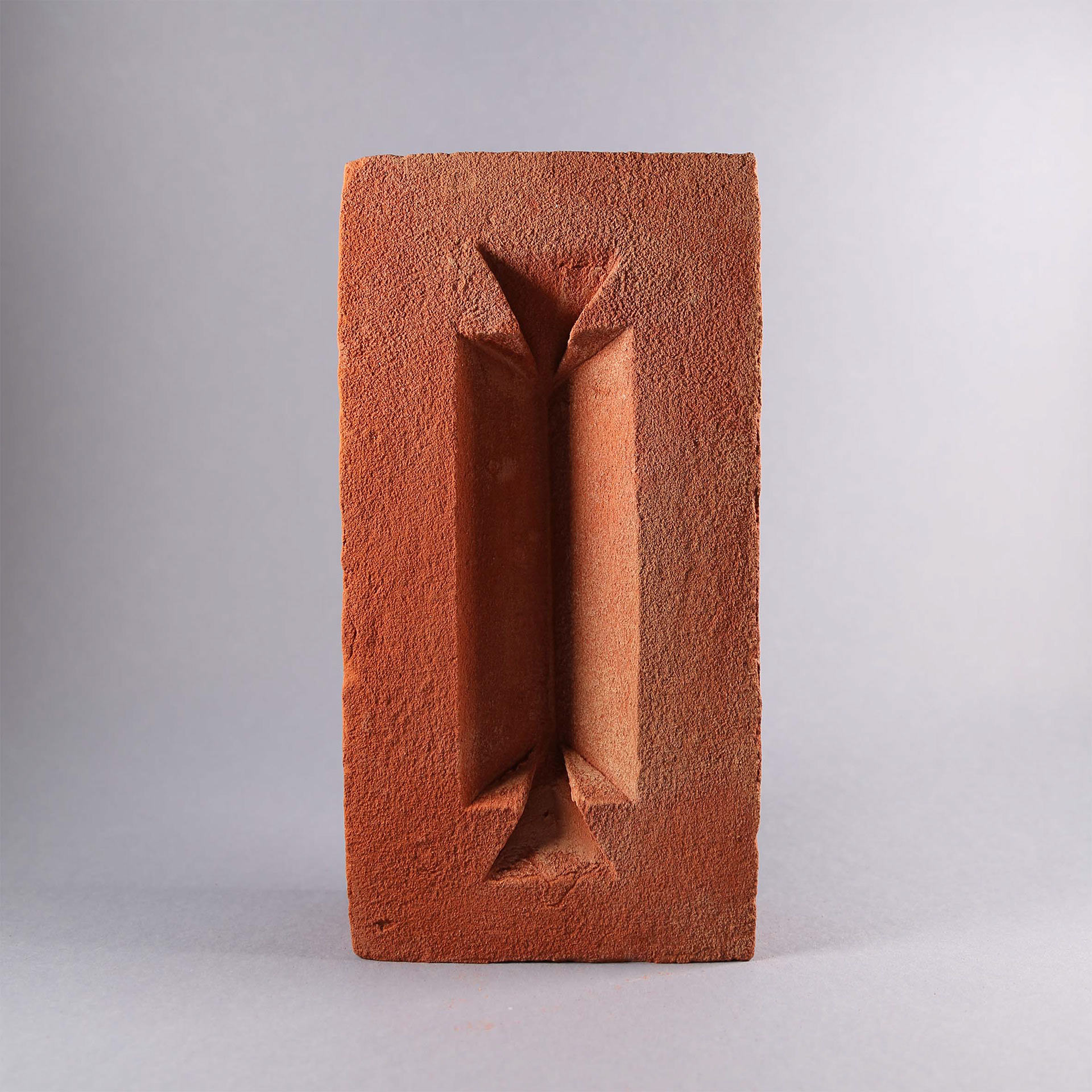
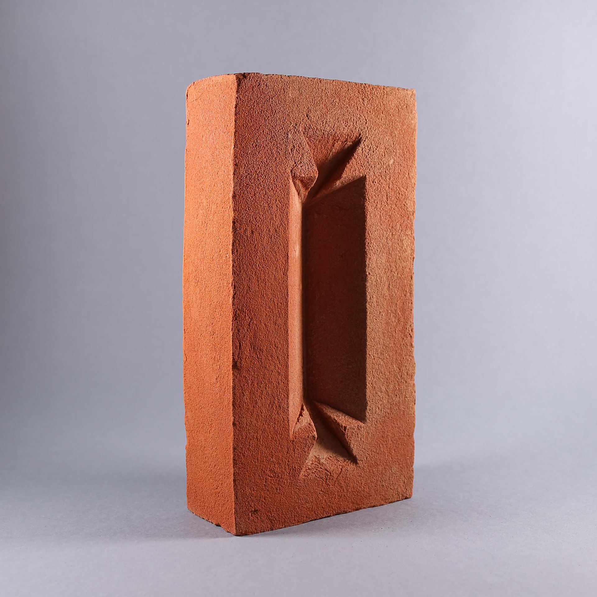
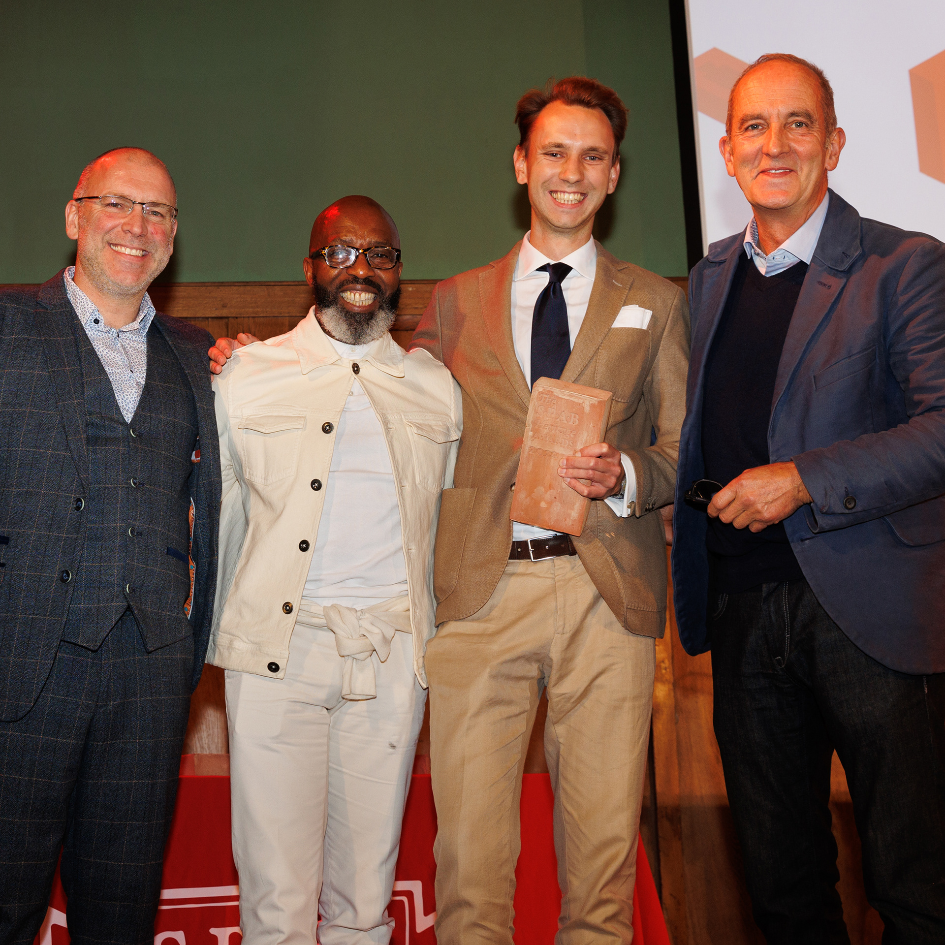
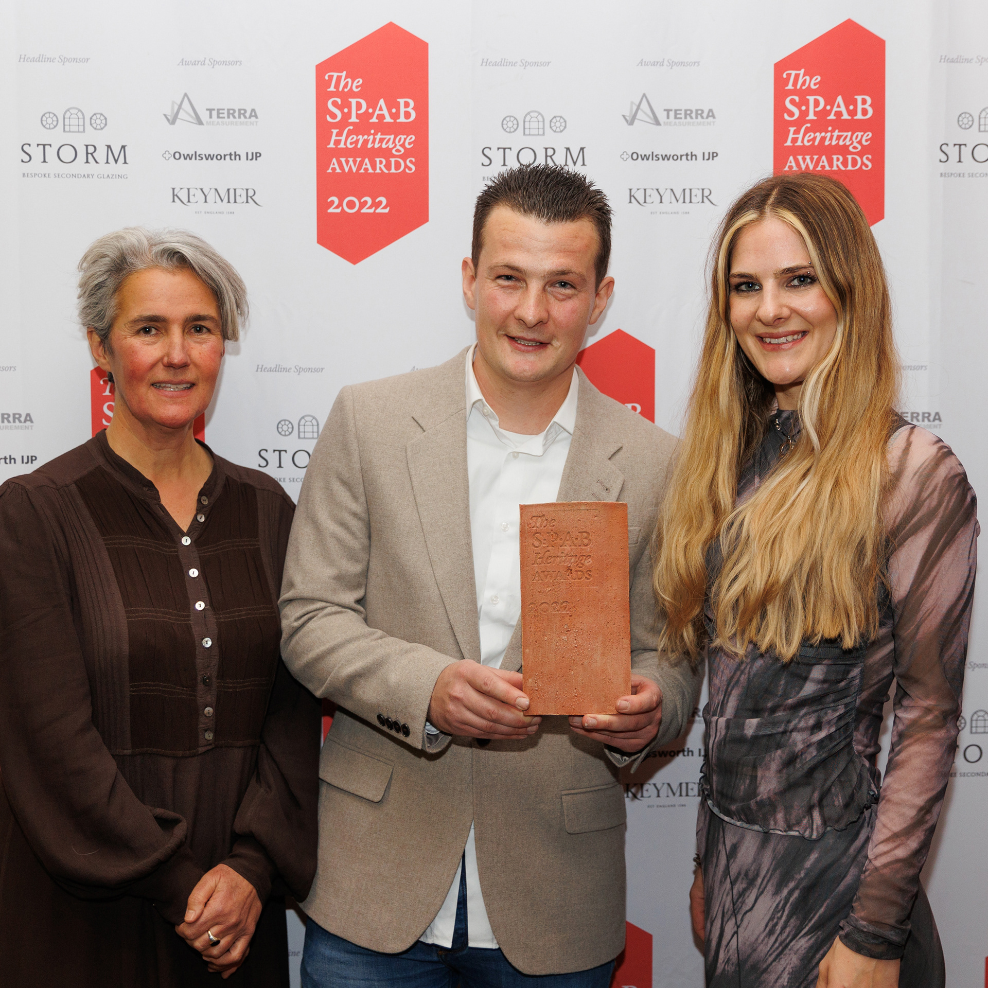
The design idea was to build the identity around a trophy made from a bespoke heritage-proportioned brick, creating an affordable and covetable object that symbolises the Society’s approach, celebrates craftsmanship and appeals to potential Awards applicants.
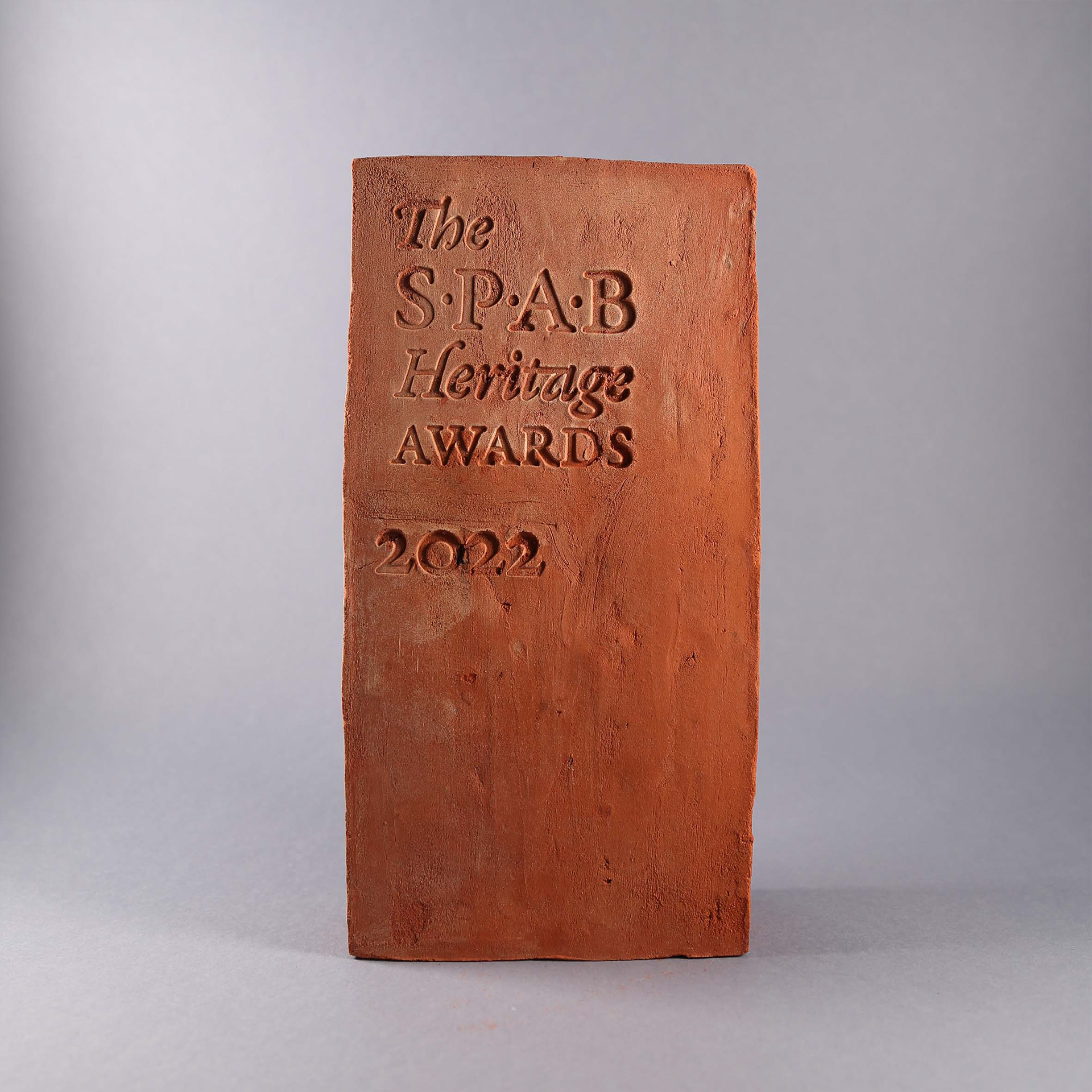
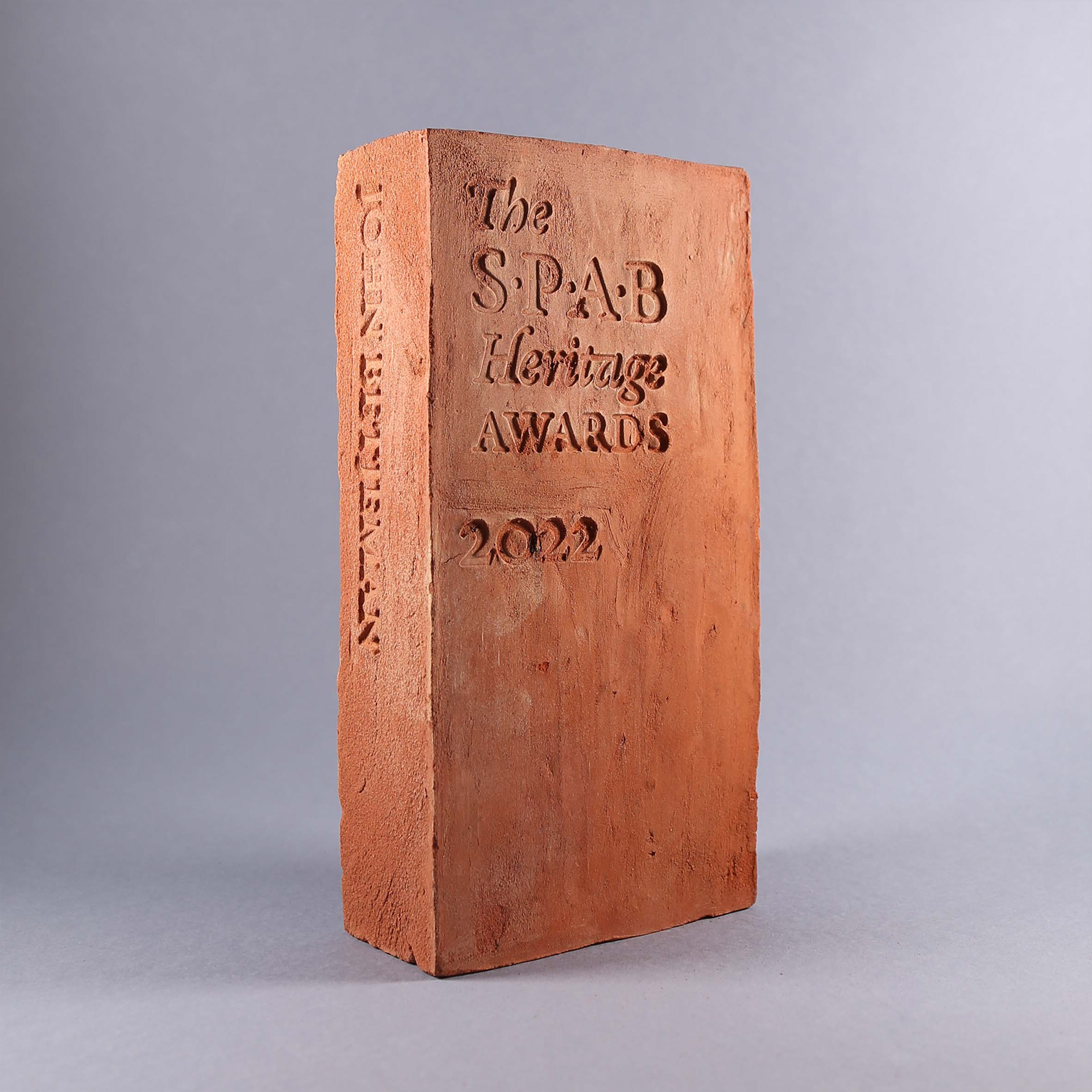
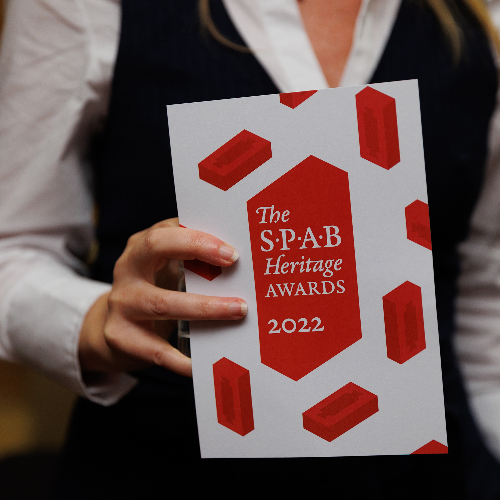
The trophy and visual identity were designed in parallel, with the brick incorporating a recess (or 'frog' as it's known in the trade) based on the original SPAB toffee wrapper-shaped logo. The primary colour, red, was carried over from the SPAB identity, and the typography uses the classic humanist typeface Garamond, for its elegance and its visual link to the existing logo lettering.
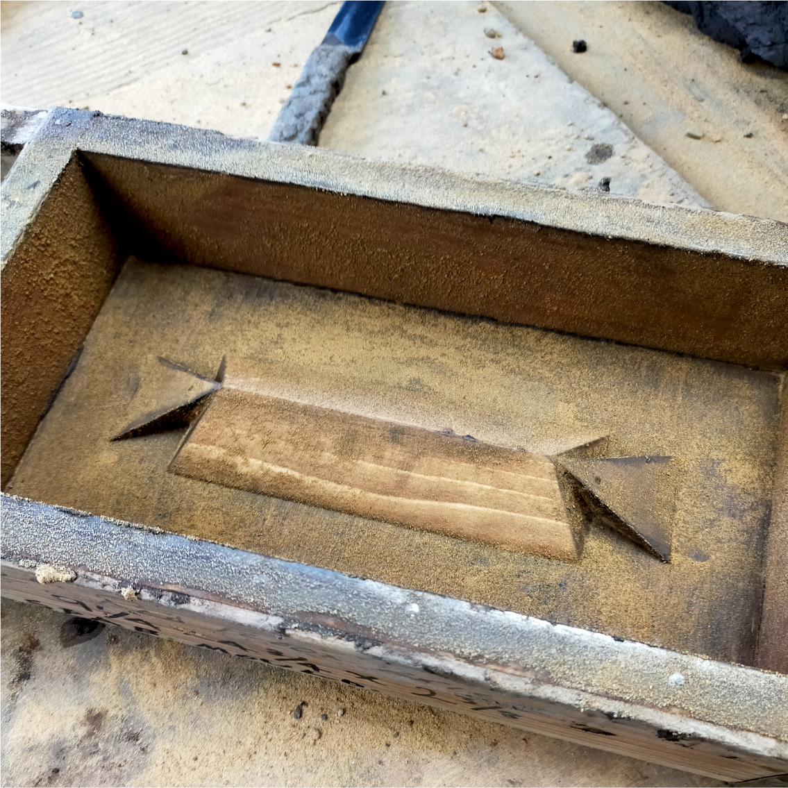
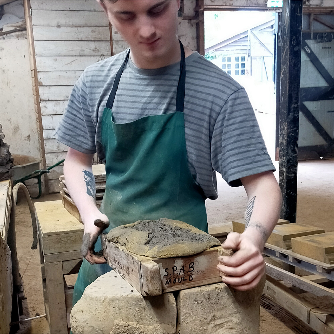
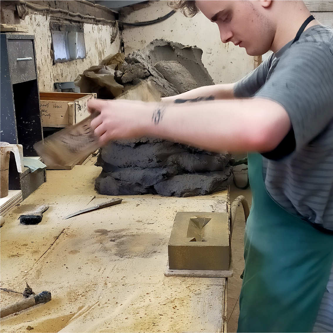
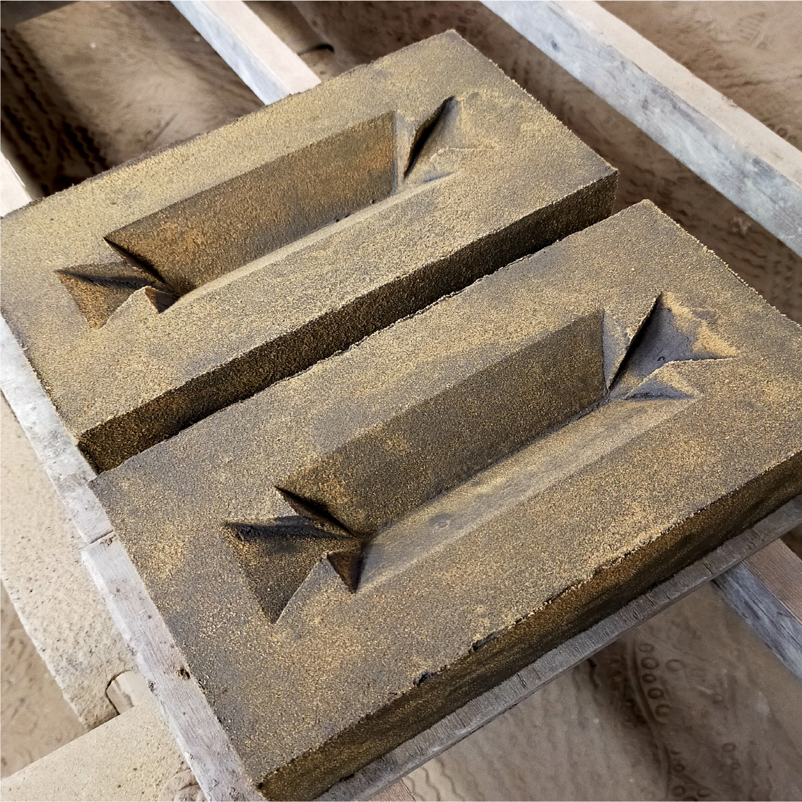
One of SPAB’s associated heritage brickmakers, the Bulmer Brick & Tile Company, was commissioned to manufacture the physical trophies. Each red brick trophy is hand-made using traditional methods and includes the logo and award category debossed into the clay.
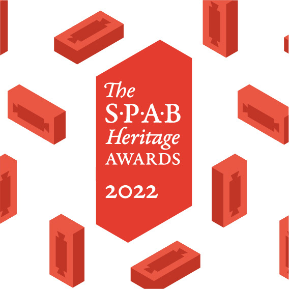
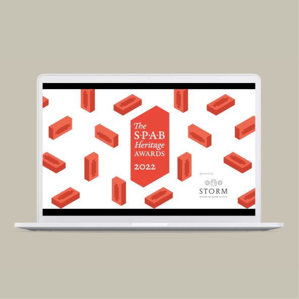
A silhouette of the brick was developed for the logo, and a repeat pattern created using isometric illustrations positioned in the six different orientations that bricks can be laid (stretcher, header, rowlock, rowlock stretcher, soldier and sailor).
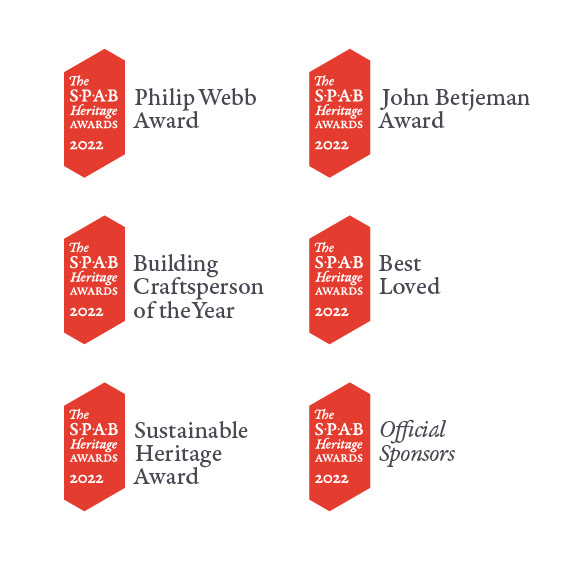
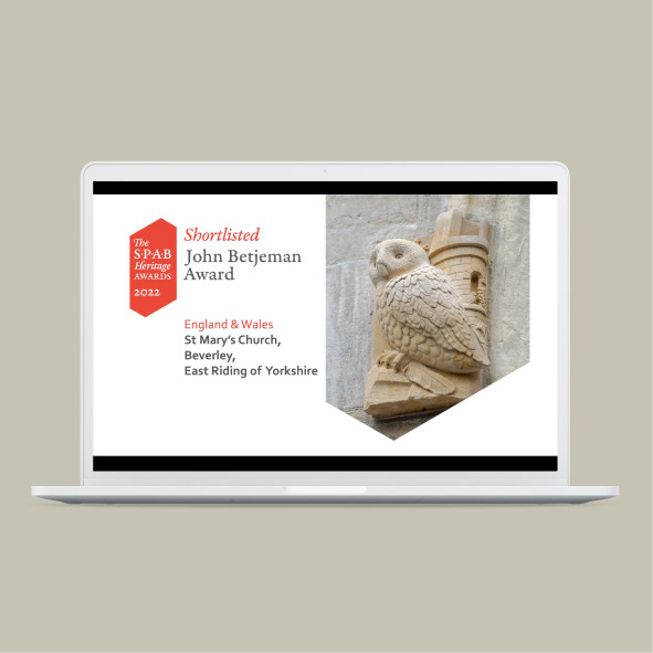
Logos were developed for each of the award categories and website graphics were designed along with an animated version of the awards logo for social media.
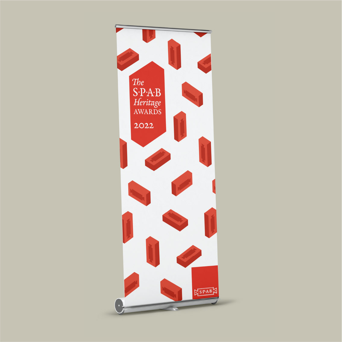
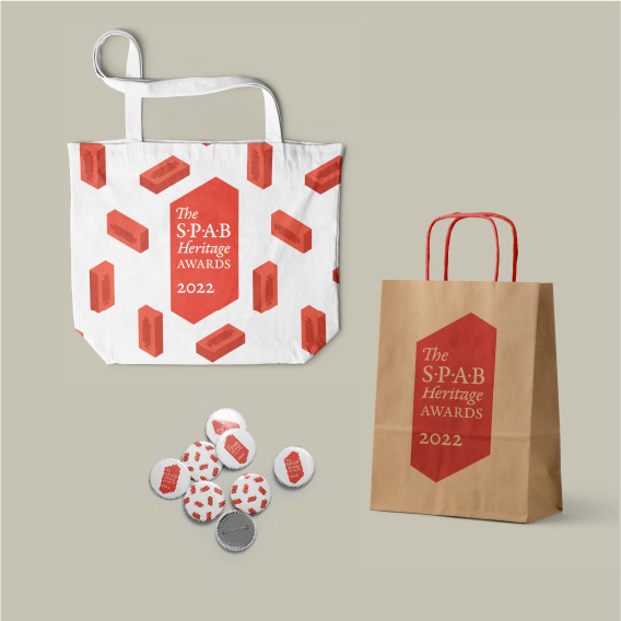

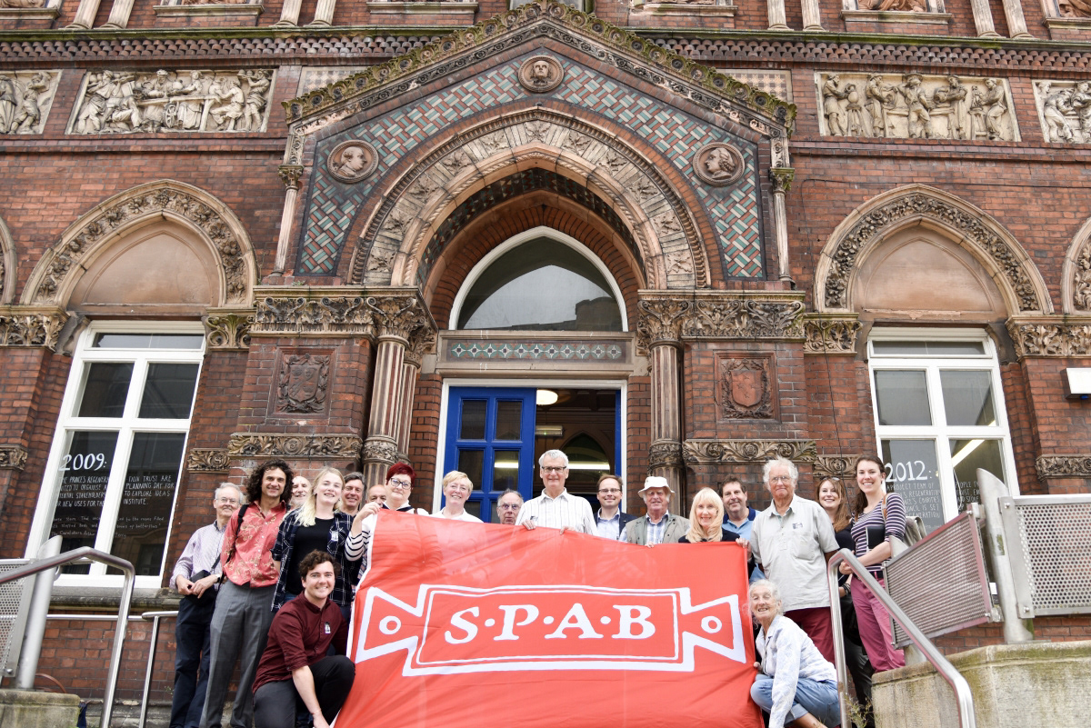
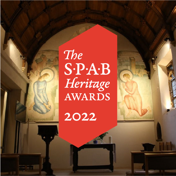
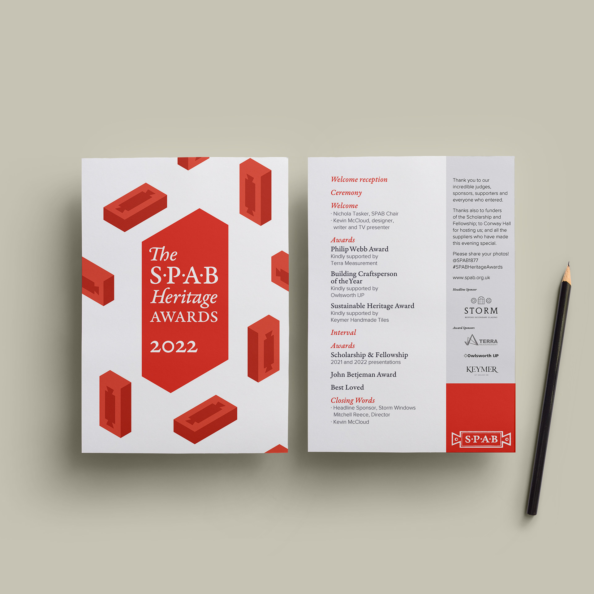
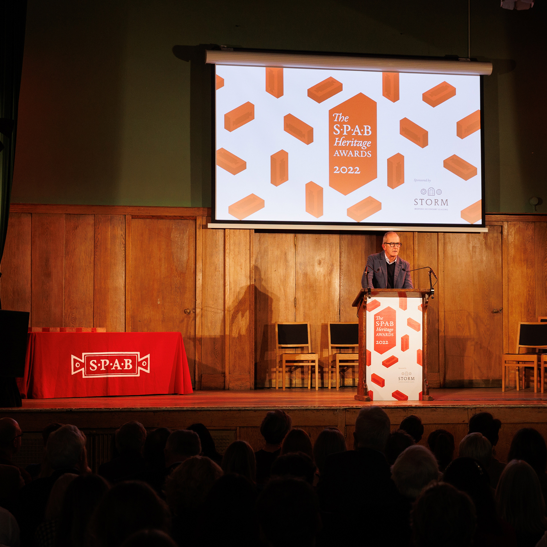
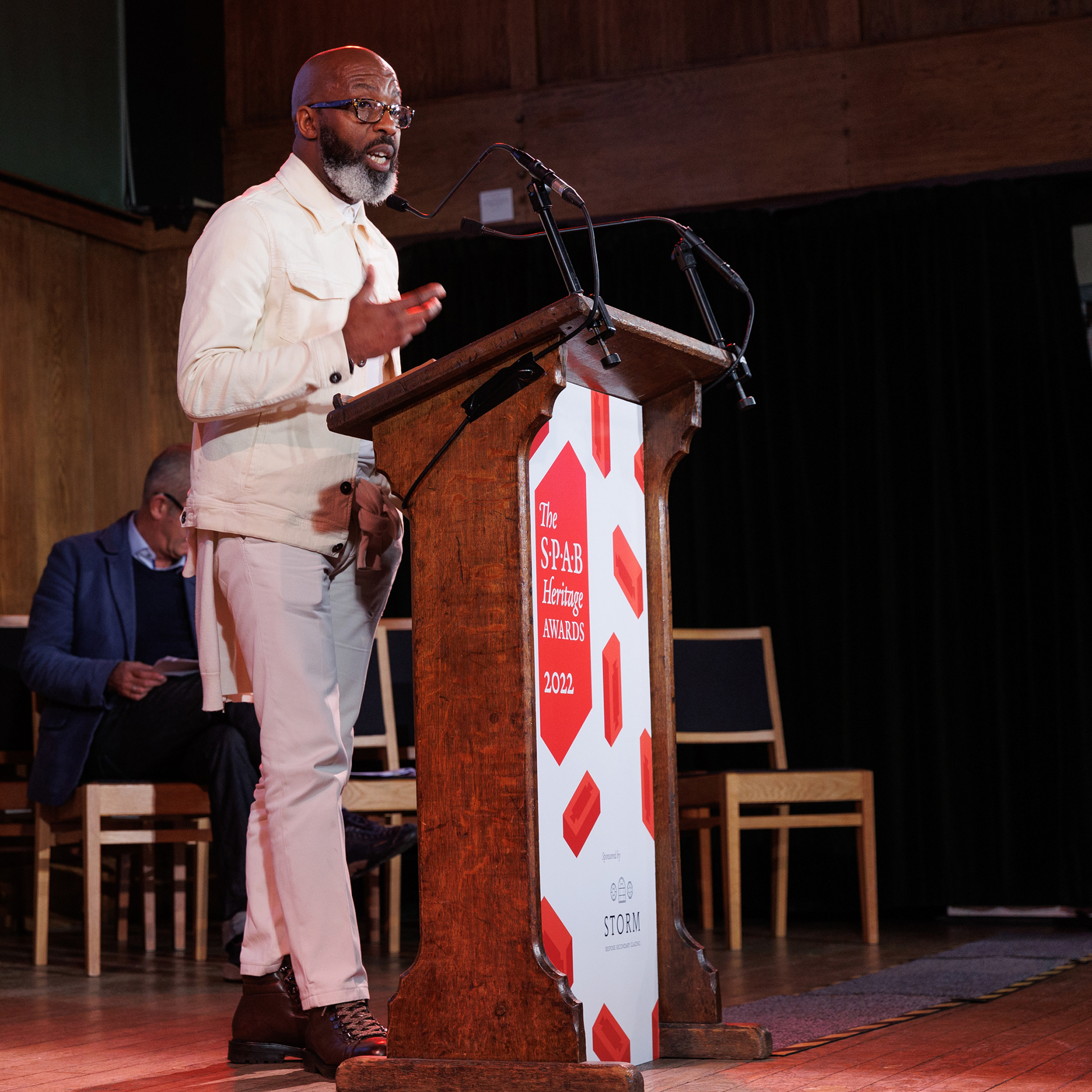
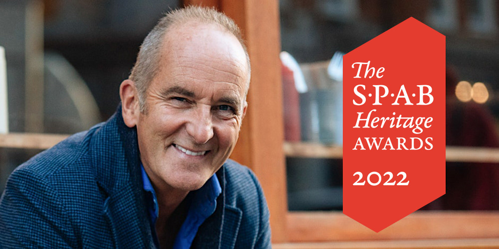
A second brief followed to design the event display graphics, programme and on-screen presentation for the first awards ceremony. The ceremony was held at the Conway Hall, London, and was hosted by Kevin McLoud, SPAB's official ambassador.

“Pete created something that looks so fresh whilst still incorporating a nod to our heritage. It’s really beautiful, playful design that we couldn’t be happier with”
Ali McClary, Communications Manager
“Pete immediately understood what the SPAB is about and captured the brief beautifully. It was important to us that the design had a clear link to the handmade, to beautiful craftsmanship, and he achieved that absolutely, with a design that was also fresh and distinctive. It was magical to see the bricks come to life in the yard. The design literally emerging from the clay. It delighted every one of our guests.”
Kate Streeter, Head of Development & Communications