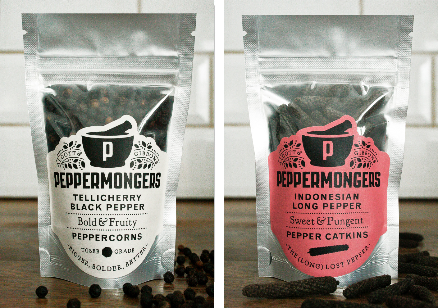
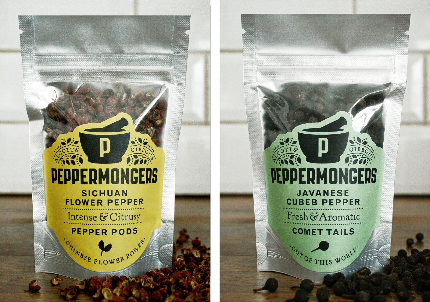
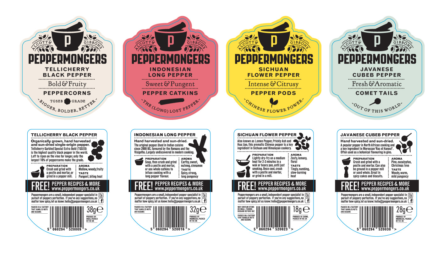
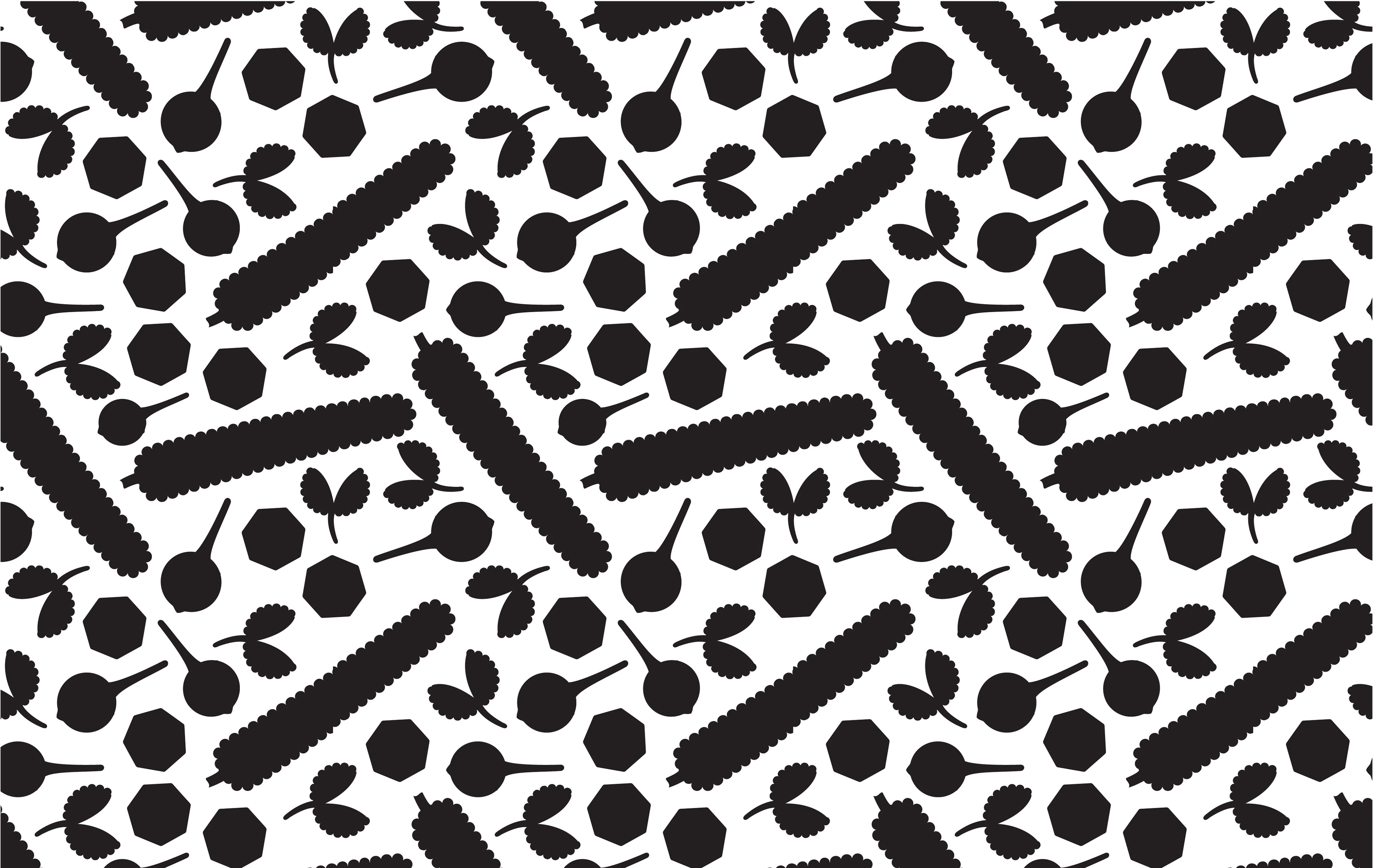
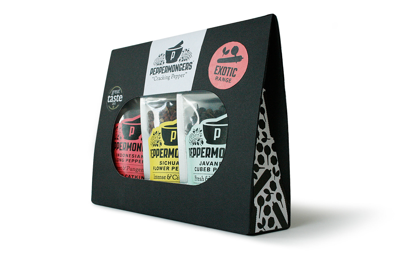
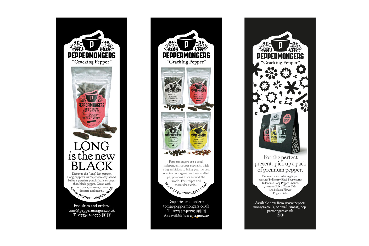
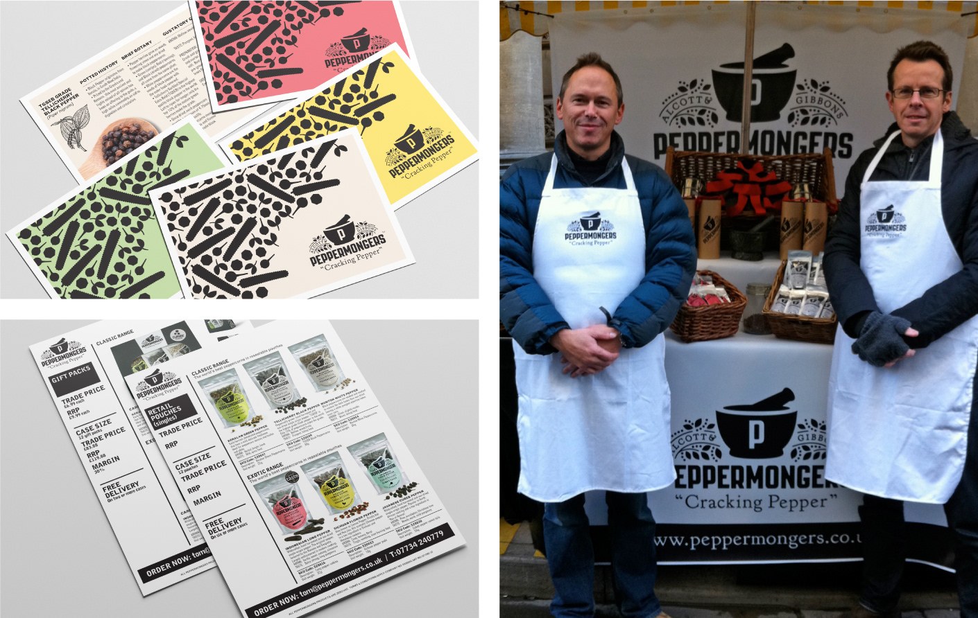
As well as an education in the highs and lows of launching a business and building a brand, Peppermongers gave us first-hand experience of the importance of an engaging story and strong visual identity to a start-up's potential for success. Launched in 2011 from a stall in Bristol's St Nicholas Market, Peppermongers quickly secured listings with Harvey Nichols, Wholefoods, Booths and hundreds of independent delis. After features in the national press and endorsements by Nigel Slater, Rachel Khoo and Jamie's Cookery School, Peppermongers was bought by J.C. Peacock & Co and merged with their brand Salthouse.
Identity & Packaging Design
Peppermongers, Cracking Pepper
Co-founded with friend and entrepreneur Tom Alcott, Peppermongers was our own brand of gourmet peppercorns sourced from around the world. The name, along with the vine design incorporating the founders' names, represents the brand's story and alludes to spice traders of old. A pestle and mortar, key to the preparation of the peppers, is central to the packaging design and also functions as a stand-alone symbol for the brand. Illustrations of the four peppercorn varieties are used on the front of each pack to help product differentiation and come together to create a versatile brand pattern. Fresh colours and playful copy capture each pepper's unique flavour and characteristics.
NAMING · BRAND IDENTITY · RETAIL PACKAGING · GIFT PACKAGING · WEBSITE · SALES & MARKETING MATERIAL · PRESS ADS · POINT OF SALE